Client
Traine, Mainline Living & Kenzie Marketing
Services
Brand Identity
Agency
Analog Design, Vancouver BC
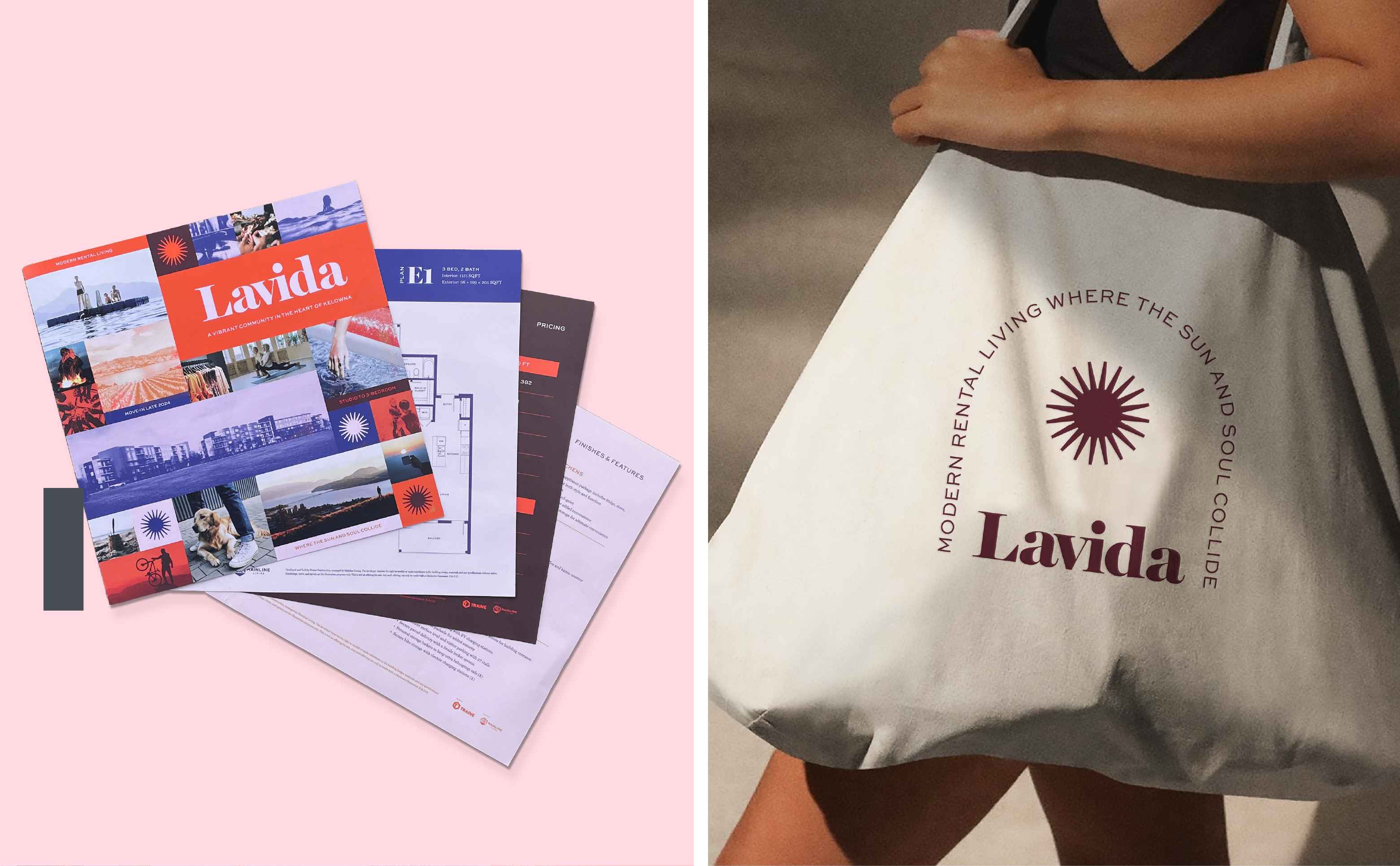
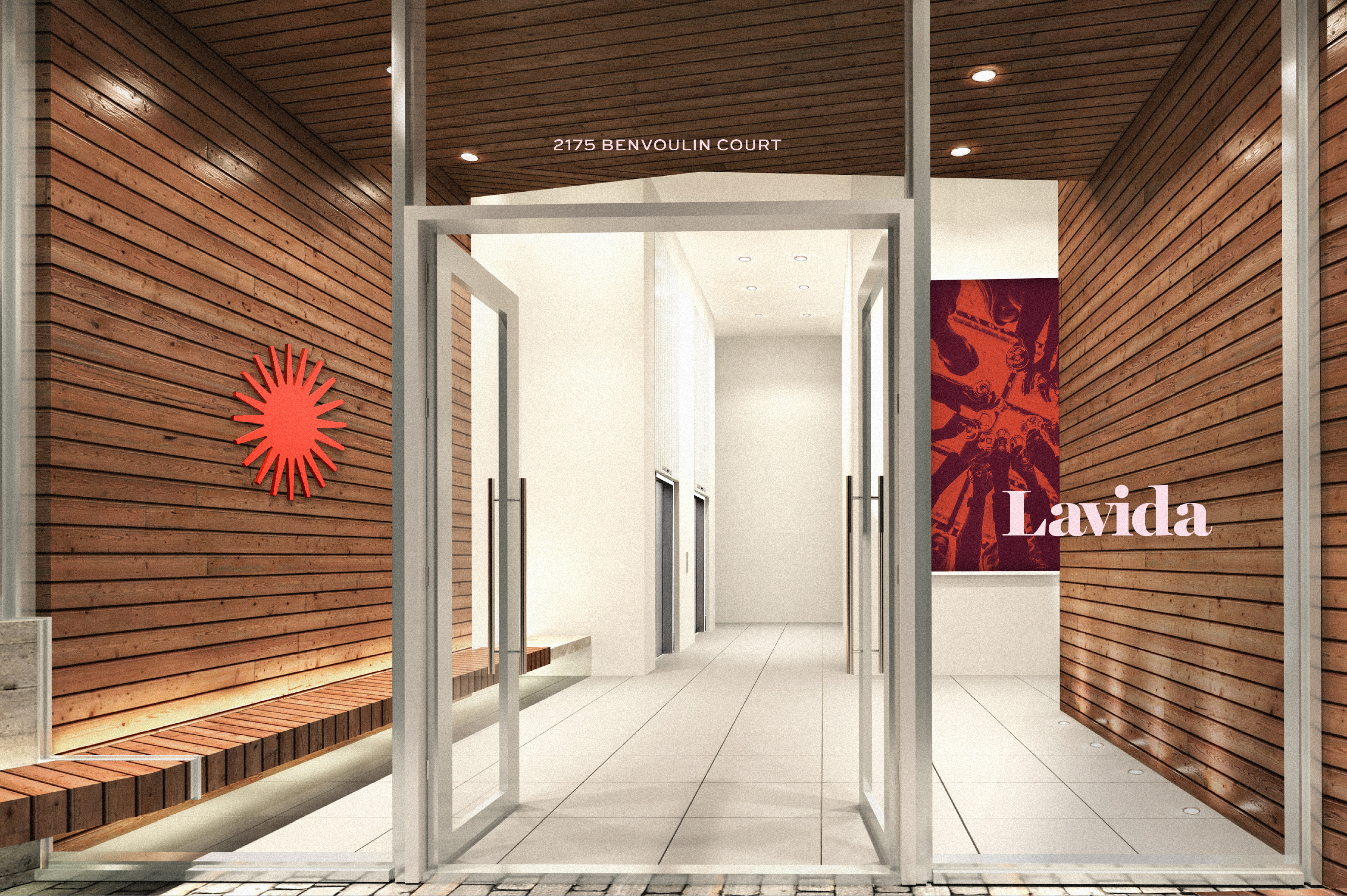
Lavida is a development project of 187 rental homes, the goal was to create a brand identity that would resonate with the energy and lifestyle of Kelowna. Kelowna has an energy all its own, this unique geography is home to many of British Columbia’s finest natural gems. From sunny beaches, rolling hills of vineyards, large sparking lakes, mountain peaks filled with fresh snow, and endless exploring with recreational attraction at its core, It’s not hard to understand why Kelowna is such a desirable place to call home.
Mood & Tone
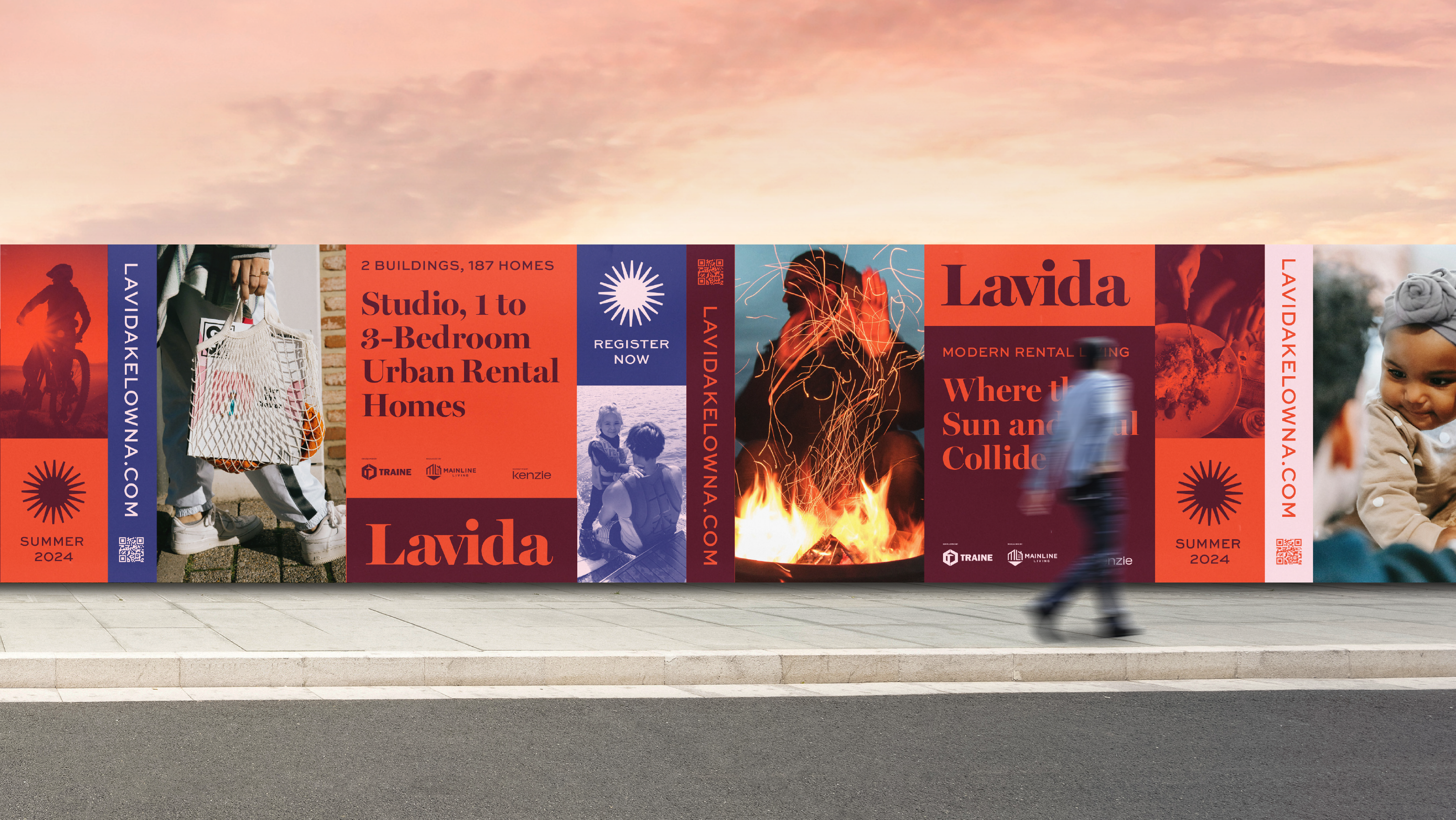
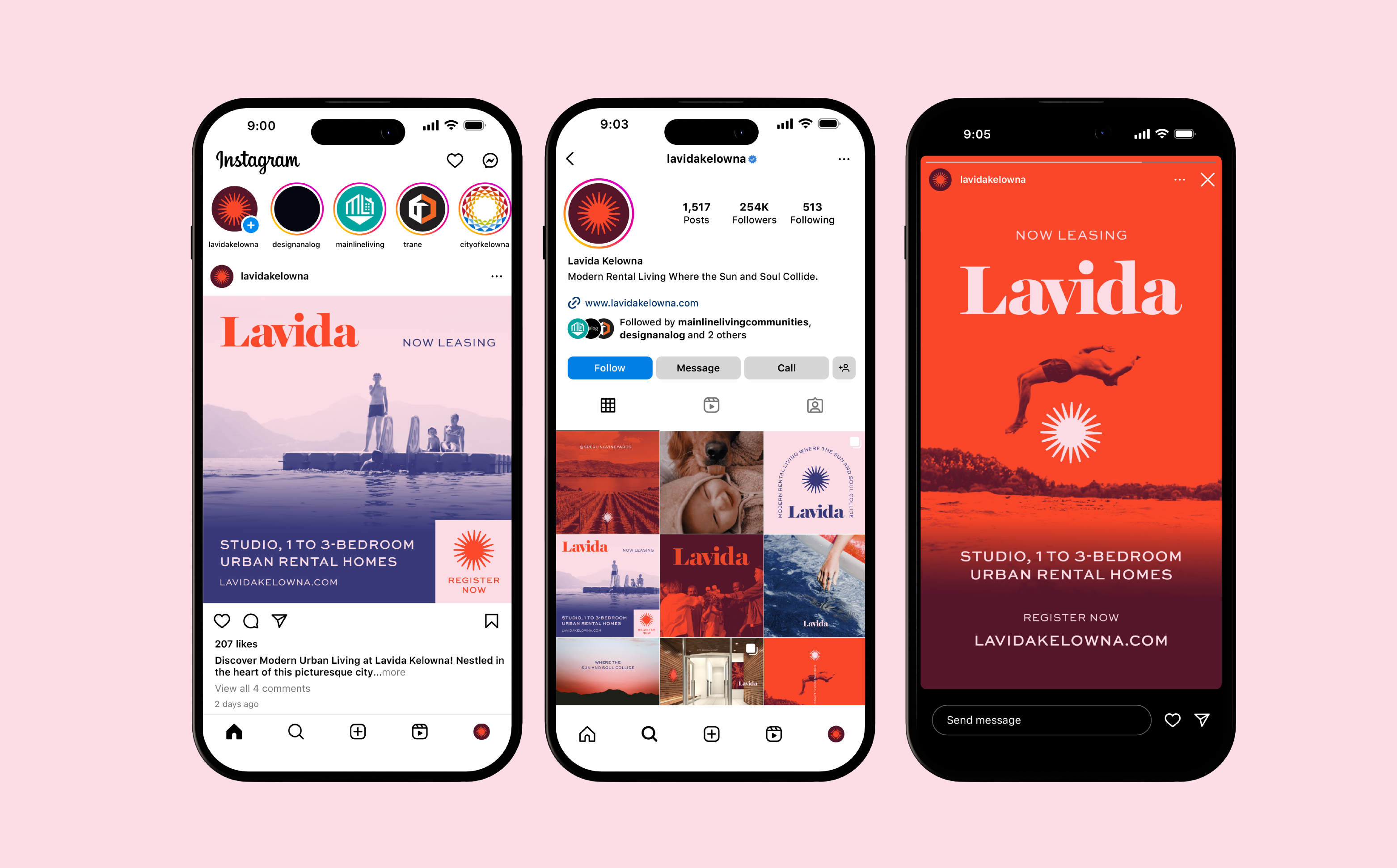
It is important to set the right mood. The goal is to adopt a “fly on the wall” approach, using documentary-style photography that fosters a sense of inclusion and allows viewers to immerse themselves into the idea of living in Kelowna.

Colour Story
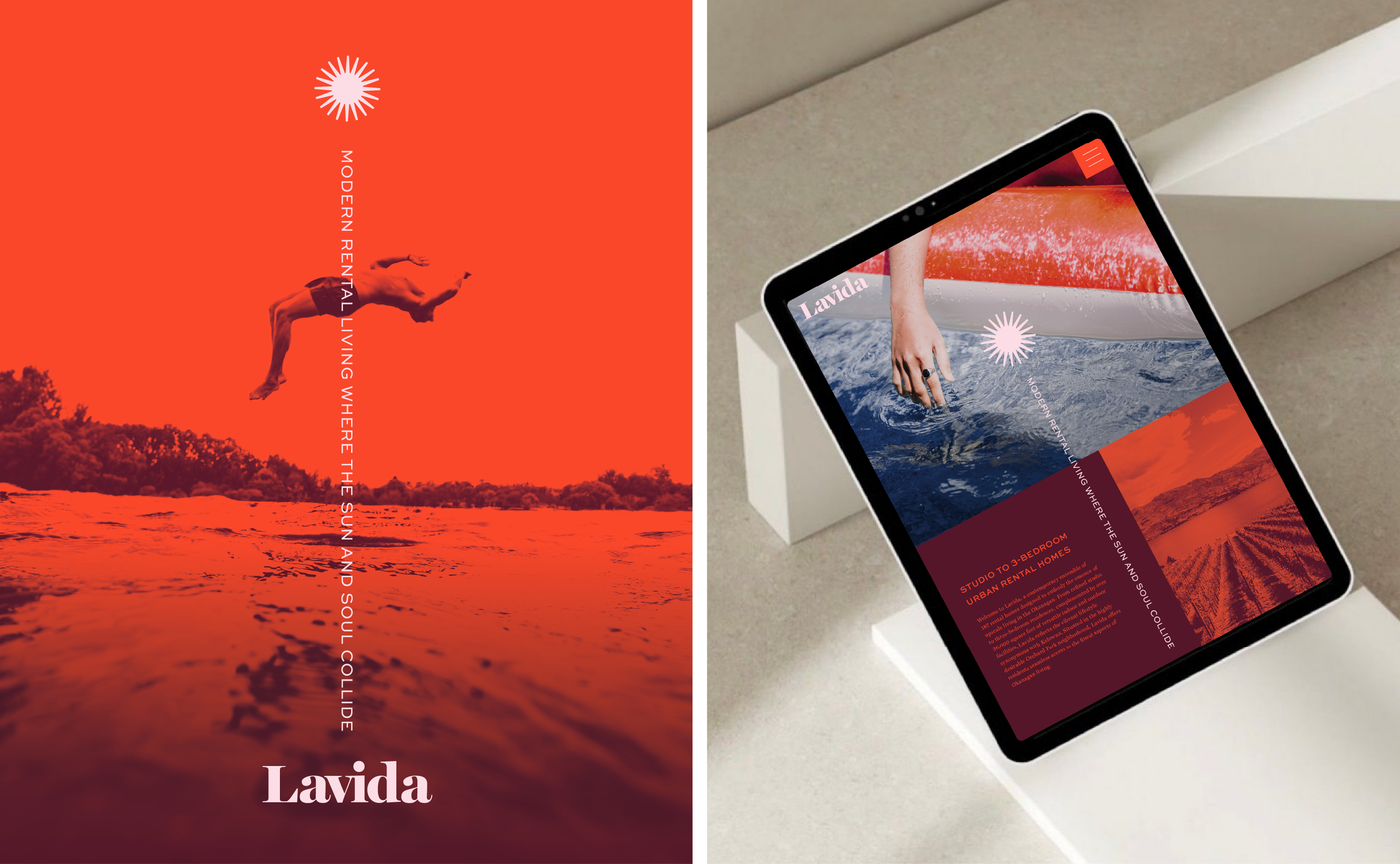
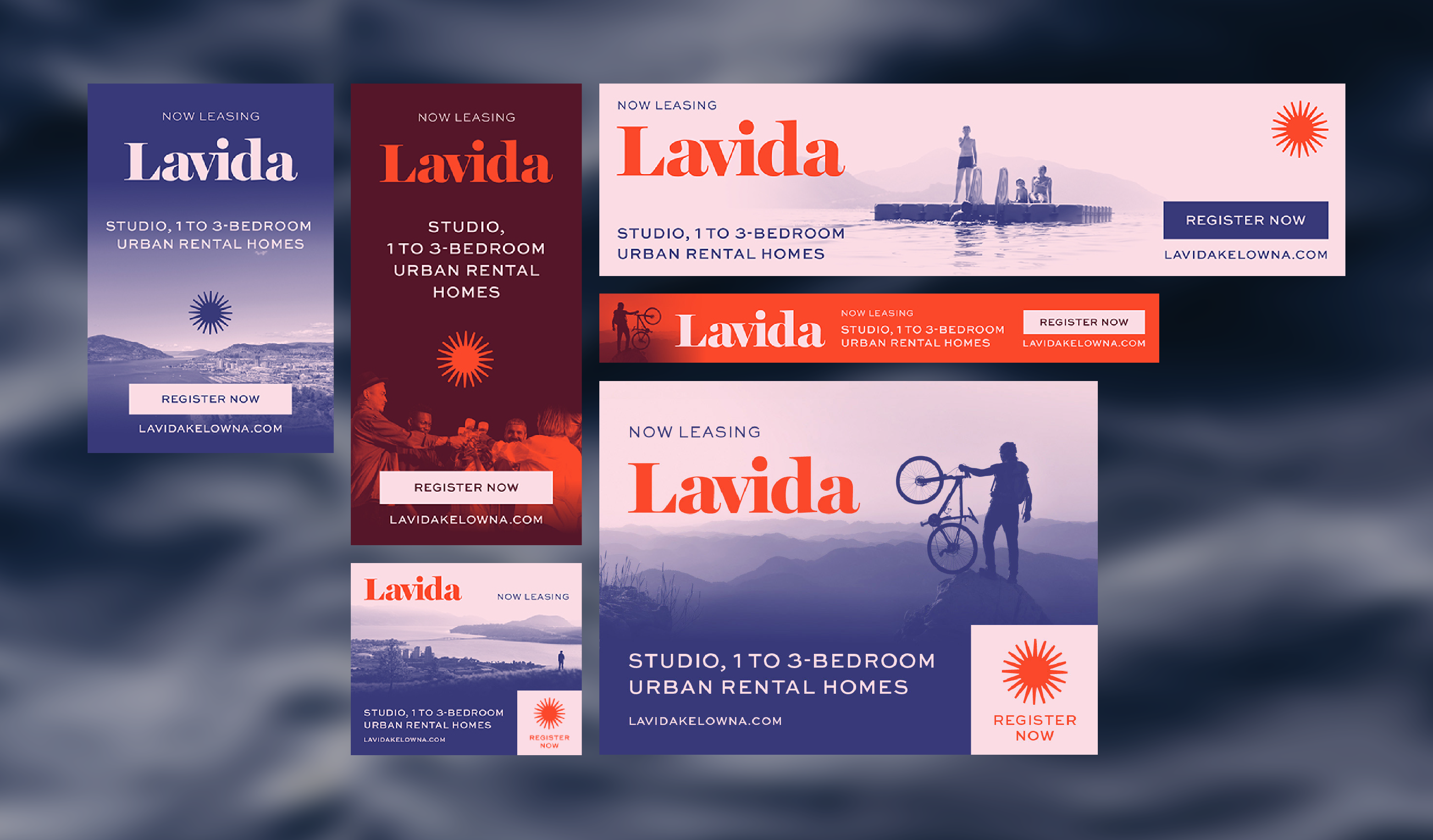
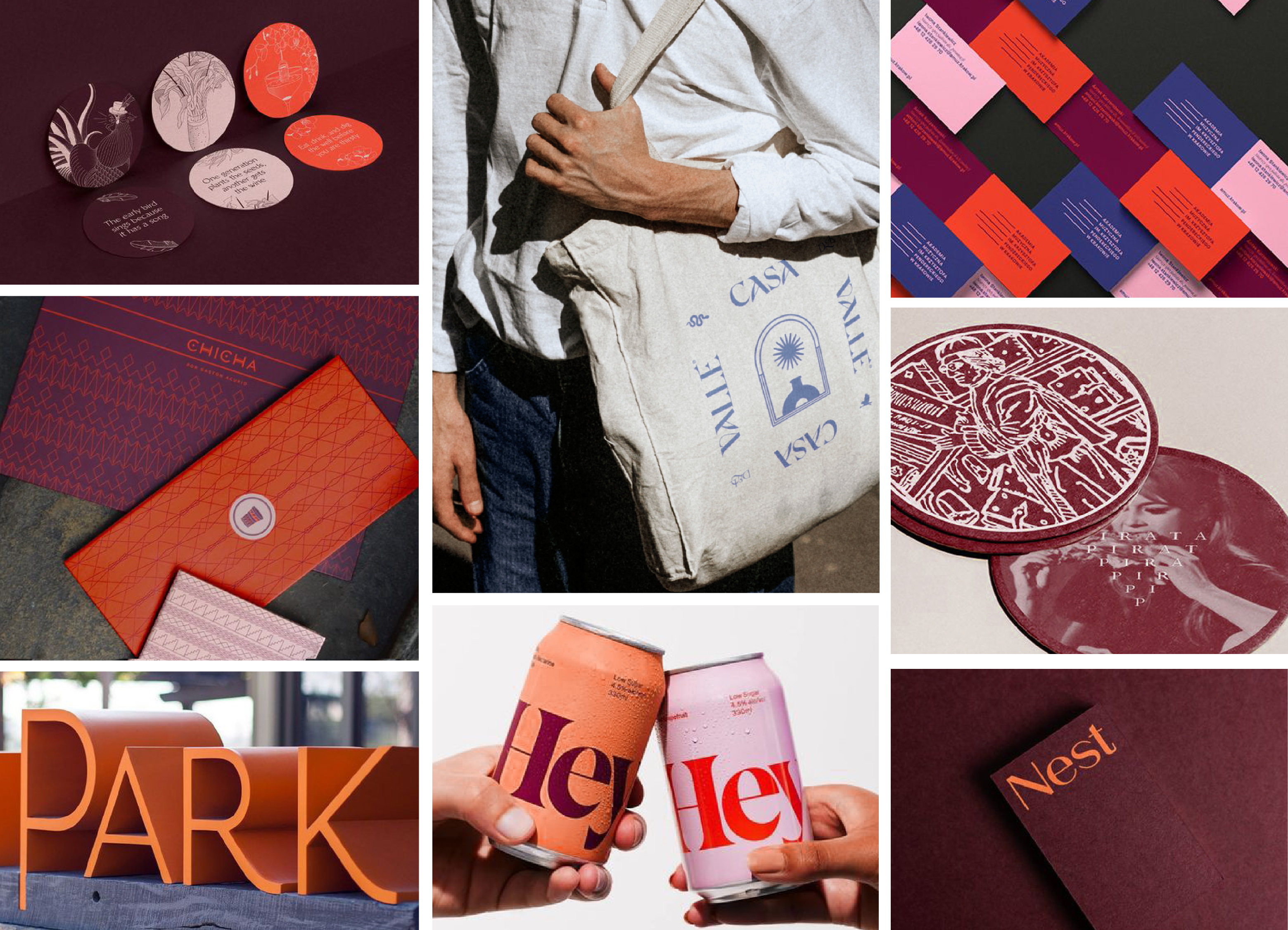
The Lavida palette exudes warmth and sophistication. Its light-hearted and fashionable spectrum expresses a fun-loving character and a laid-back attitude that is optimistic and playful.

Graphic Inspiration
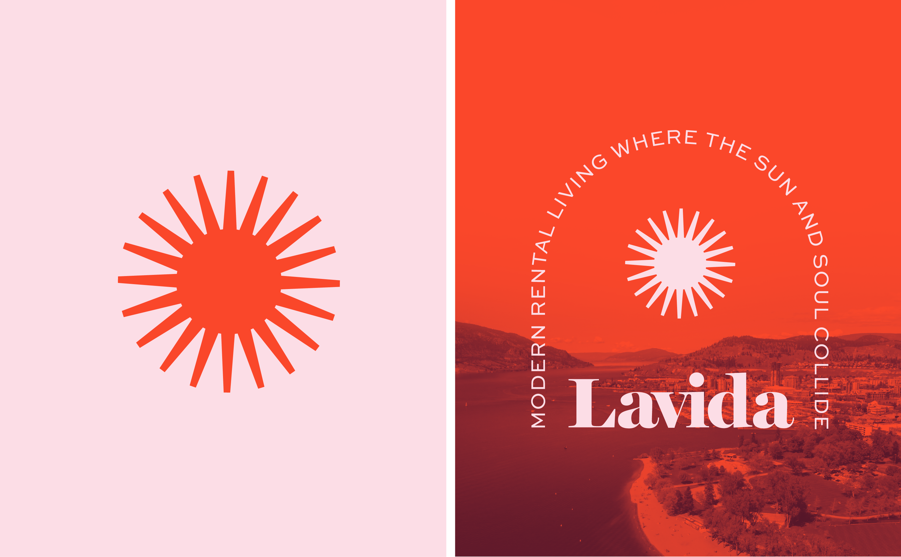
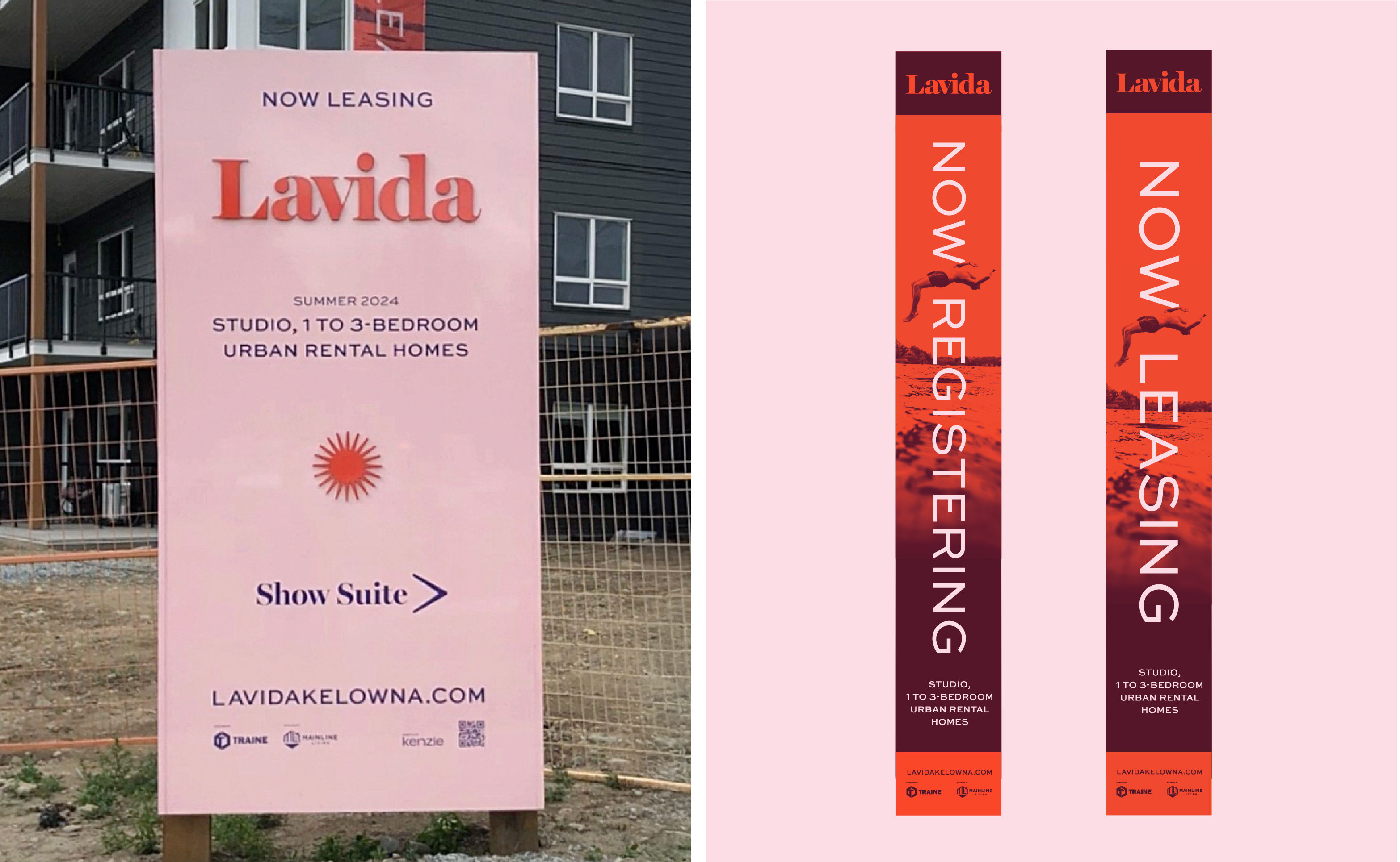
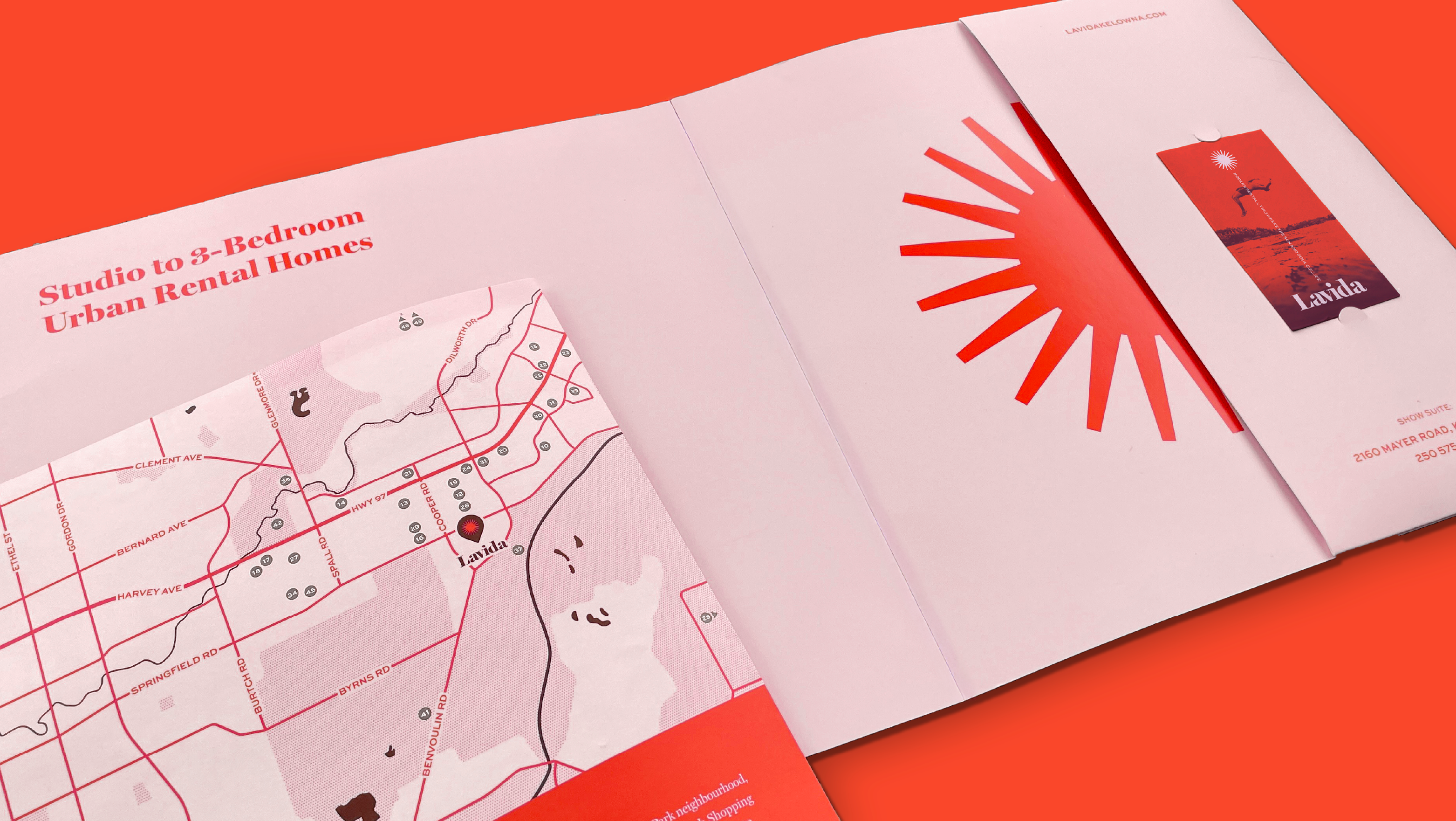
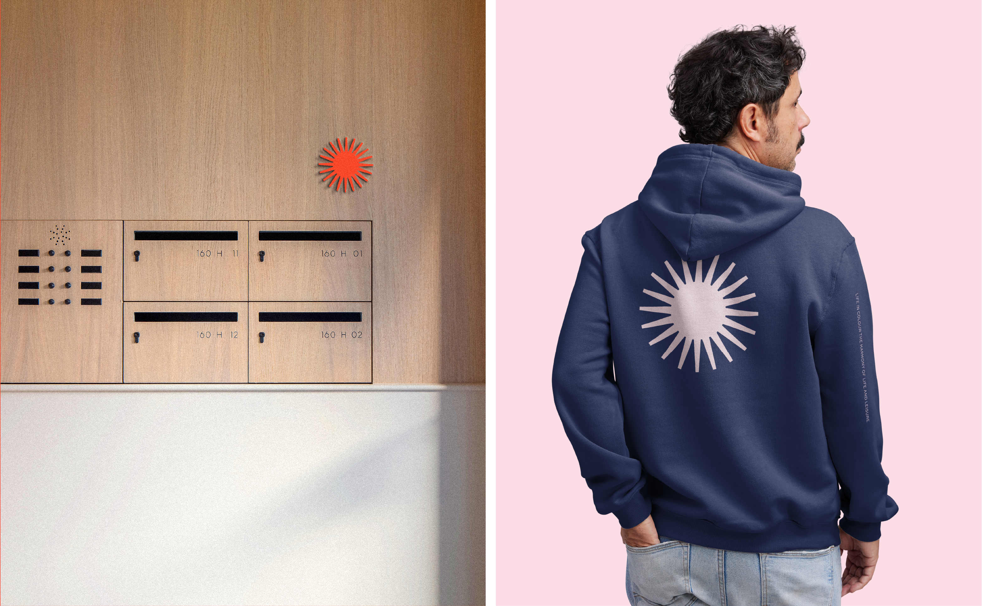
Drawing from the idea of creating warmth and play, inspiration was found in the use of high contrast, duotones, supporting iconography and photography that instilled a sense of leisure and free spirit.
Bespoke Typography
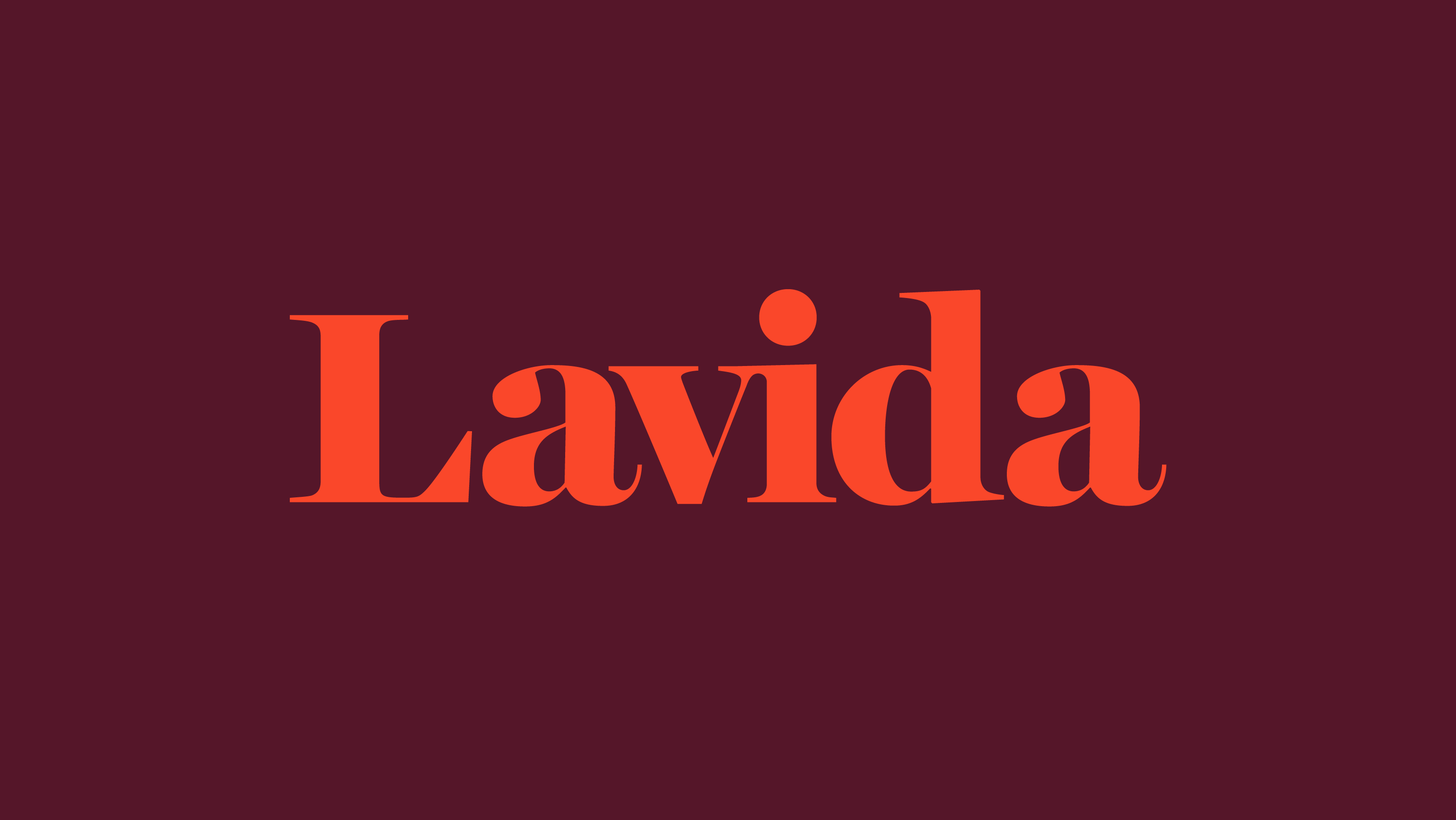
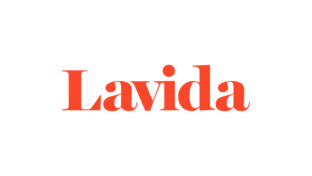
The custom Lavida wordmark balances a duo of confidence and joy. The refined flow of connection exudes a sense of energy with an approachable personality. The bold serif curves feel organic and human while having a solid foundation.


