CLIENT
Kenzie Marketing
SERVICES
Brand Identity
AGENCY
Analog Design, Vancouver BC
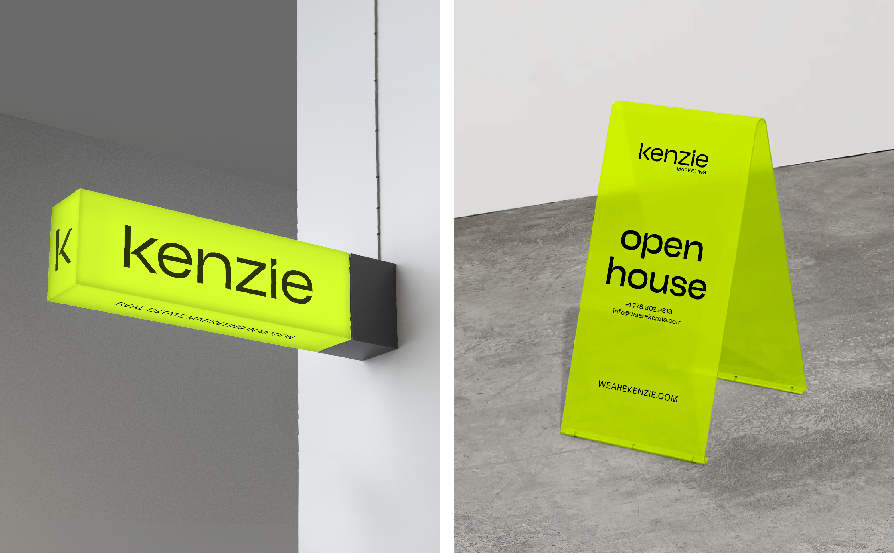
This is Kenzie, a boutique real estate sales and marketing agency built on kinetic energy that boldly connects consumers to their homes. The brief was to disrupt the North American real estate industry, typically perceived as stark and corporate. The challenge was to create an identity that conveyed a fresh youthful perspective, bravery, and sophistication to attract bold real estate developers with unique projects. With this identity, we created a movement—an ideology to destroy the “boring” and the expected with the phrase “Real Estate Marketing in Motion.”
MOOD & TONE
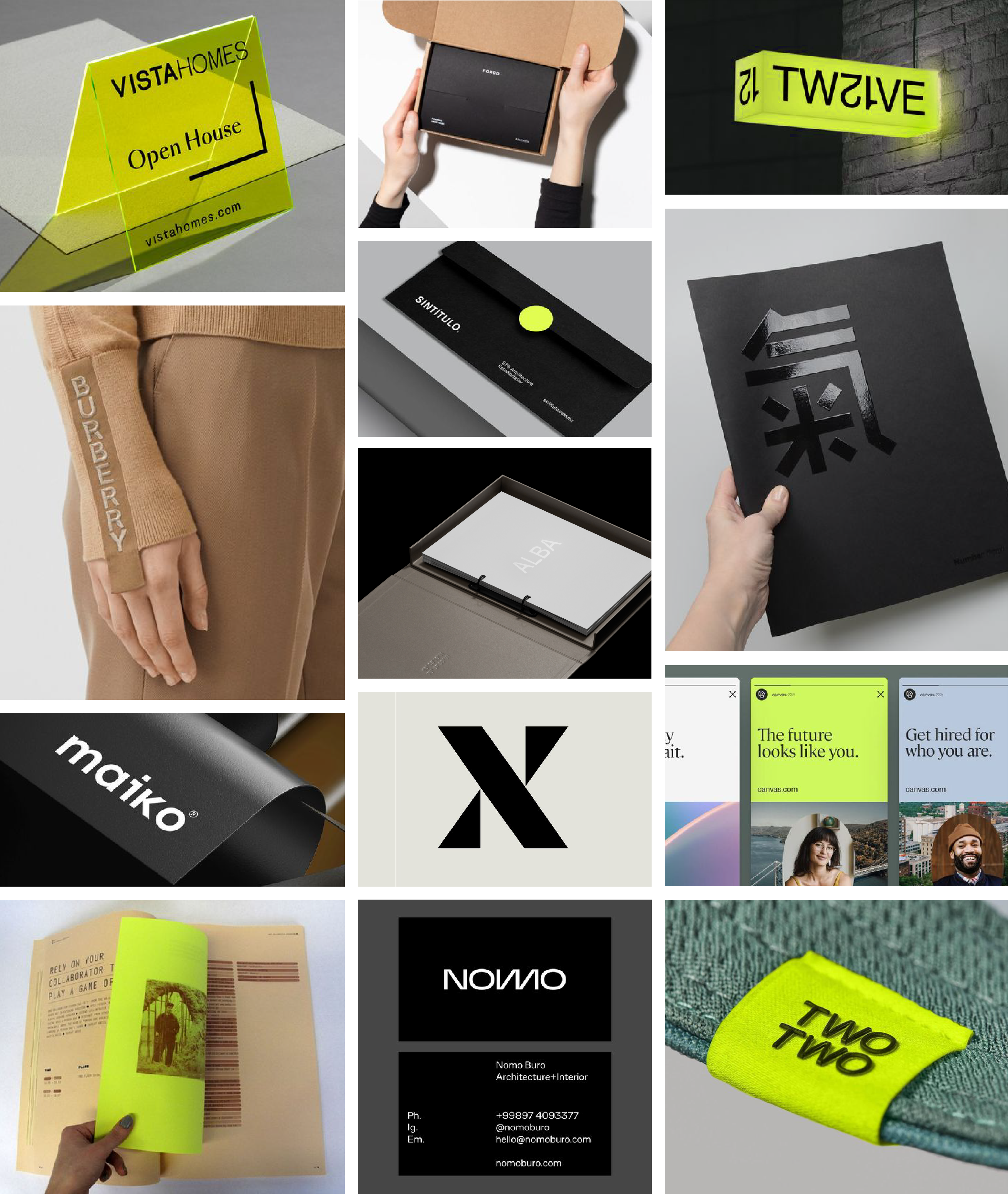
The goal is to be powerful and on-trend but showcase good taste filtering out tacky and cheap. The tone commands presence, attention, and confidence.

COLOUR STORY
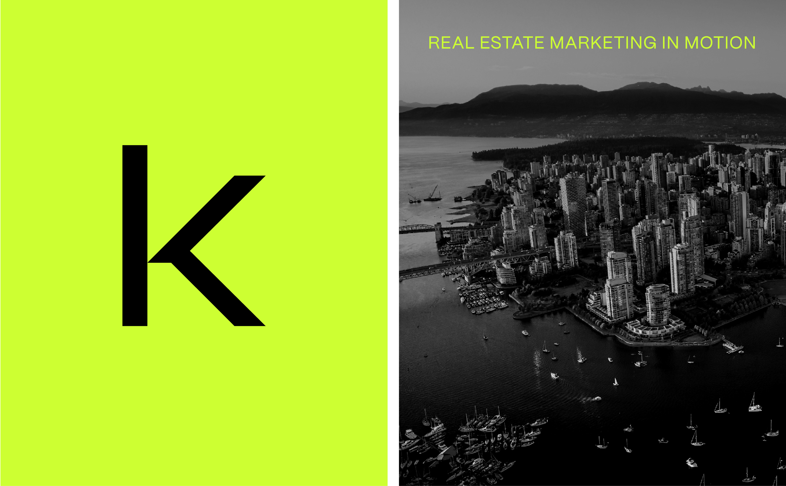
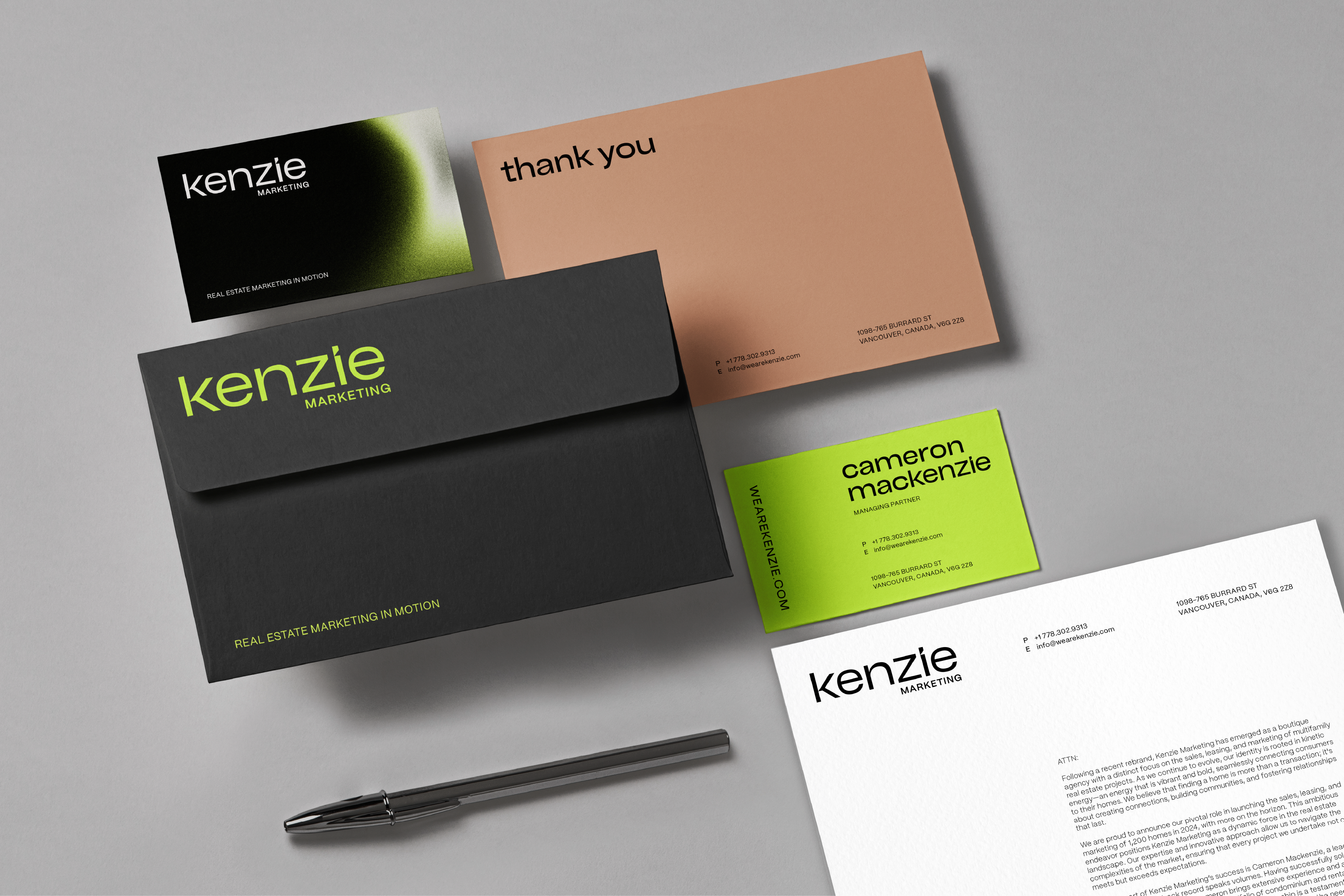
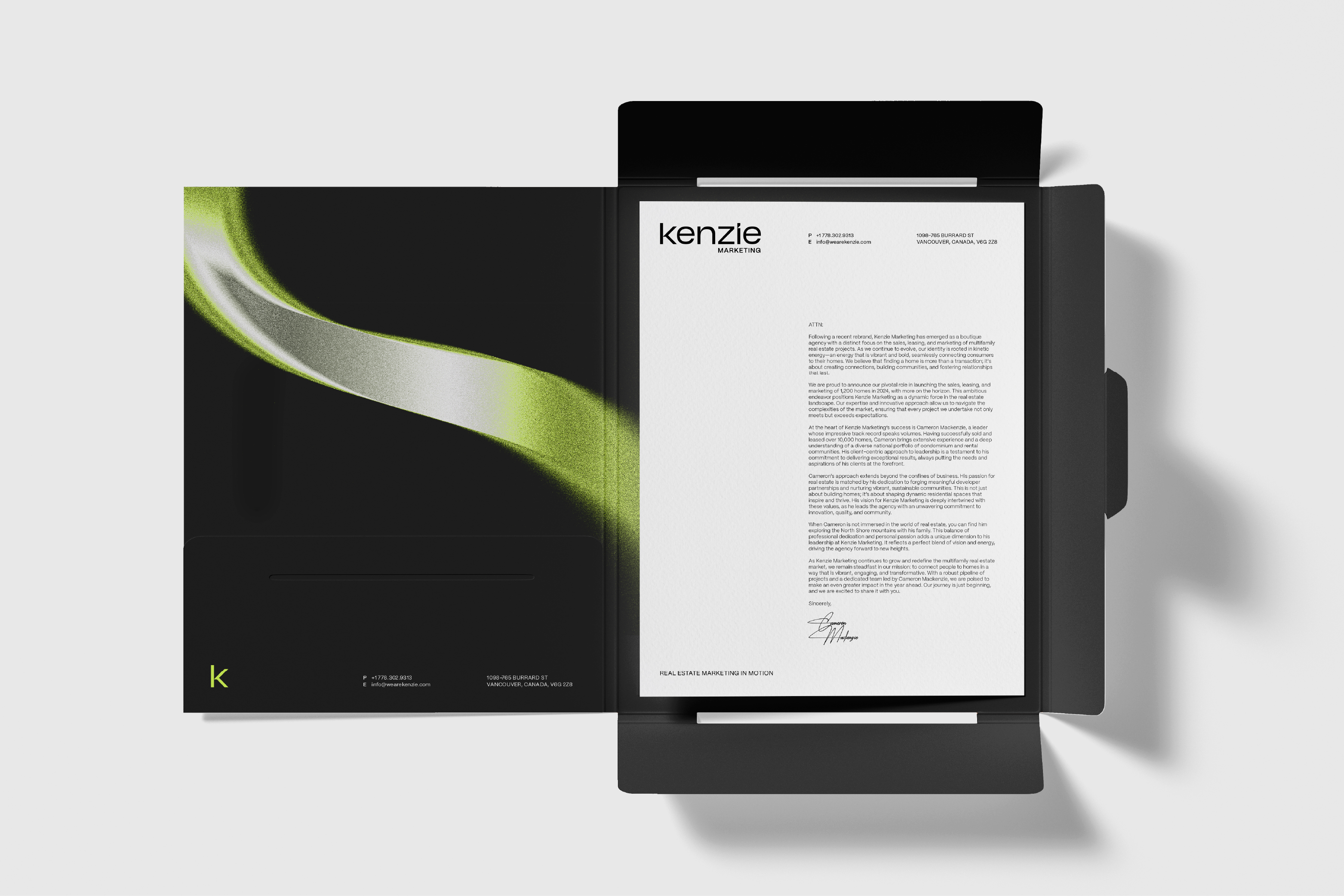
The Kenzie colour palette blends refinement with electric energy. The three base tones are modern and neutral, while the fluorescent green delivers a chic and confident layer to the brand.

GRAPHIC INSPIRATION
Inspiration came from finding a balance between minimalism and dynamic statement pieces. This was achieved through bold contrasts, modern shapes, clear typography hierarchy, and a vibrant signature colour.
BESPOKE TYPOGRAPHY
The Kenzie brand wordmark exudes a sense of refinement and precision. Its chiselled letterforms and customized angles deliver a sense of intelligence and elegance while adding shape, like a finely tailored suit. Its lowercase forms emit an approachable demeanour that is friendly yet confident.


