Client
Darwin, Citimark & Magnum
Services
Brand Identity Refresh
Agency
Analog Design, Vancouver BC
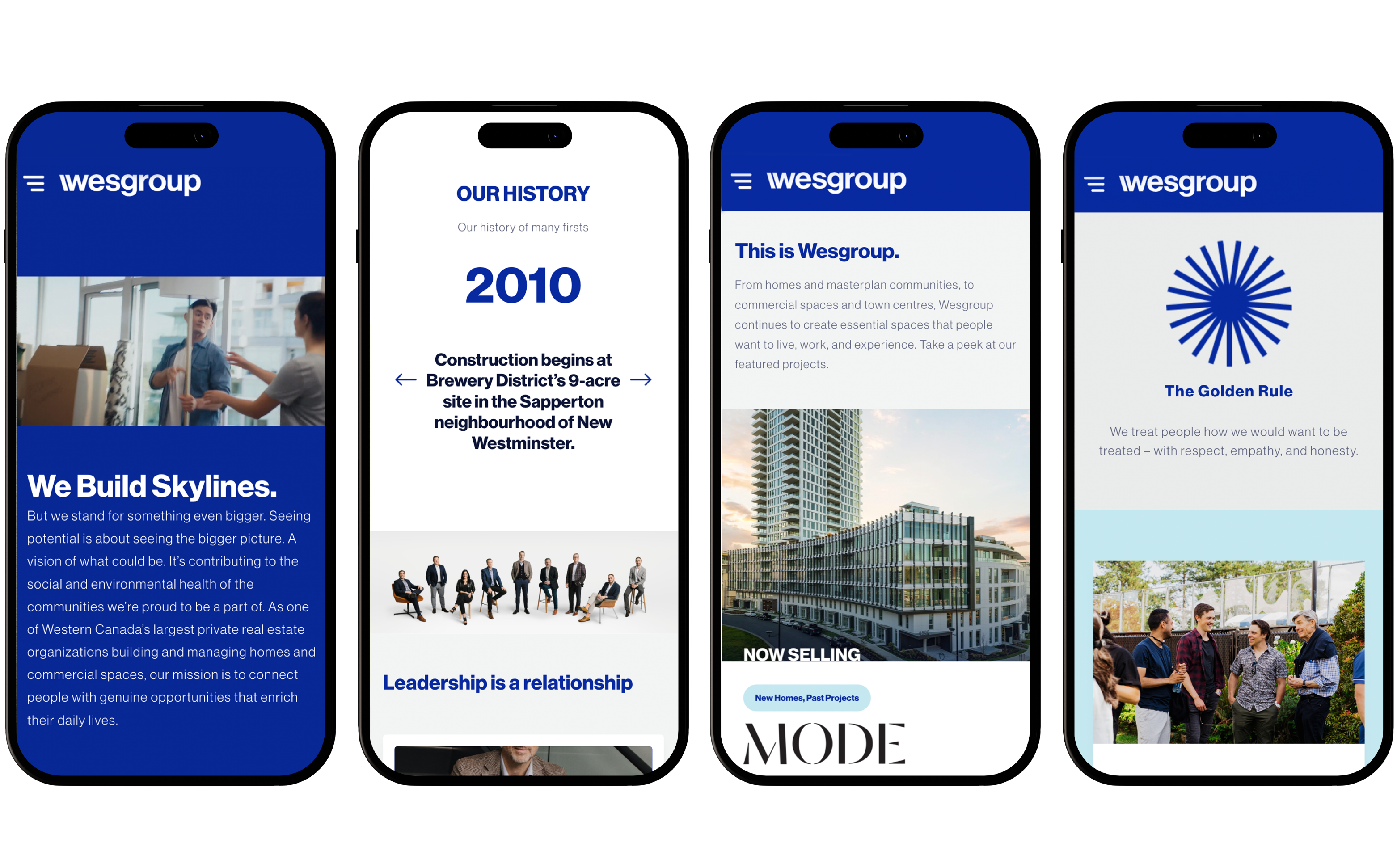
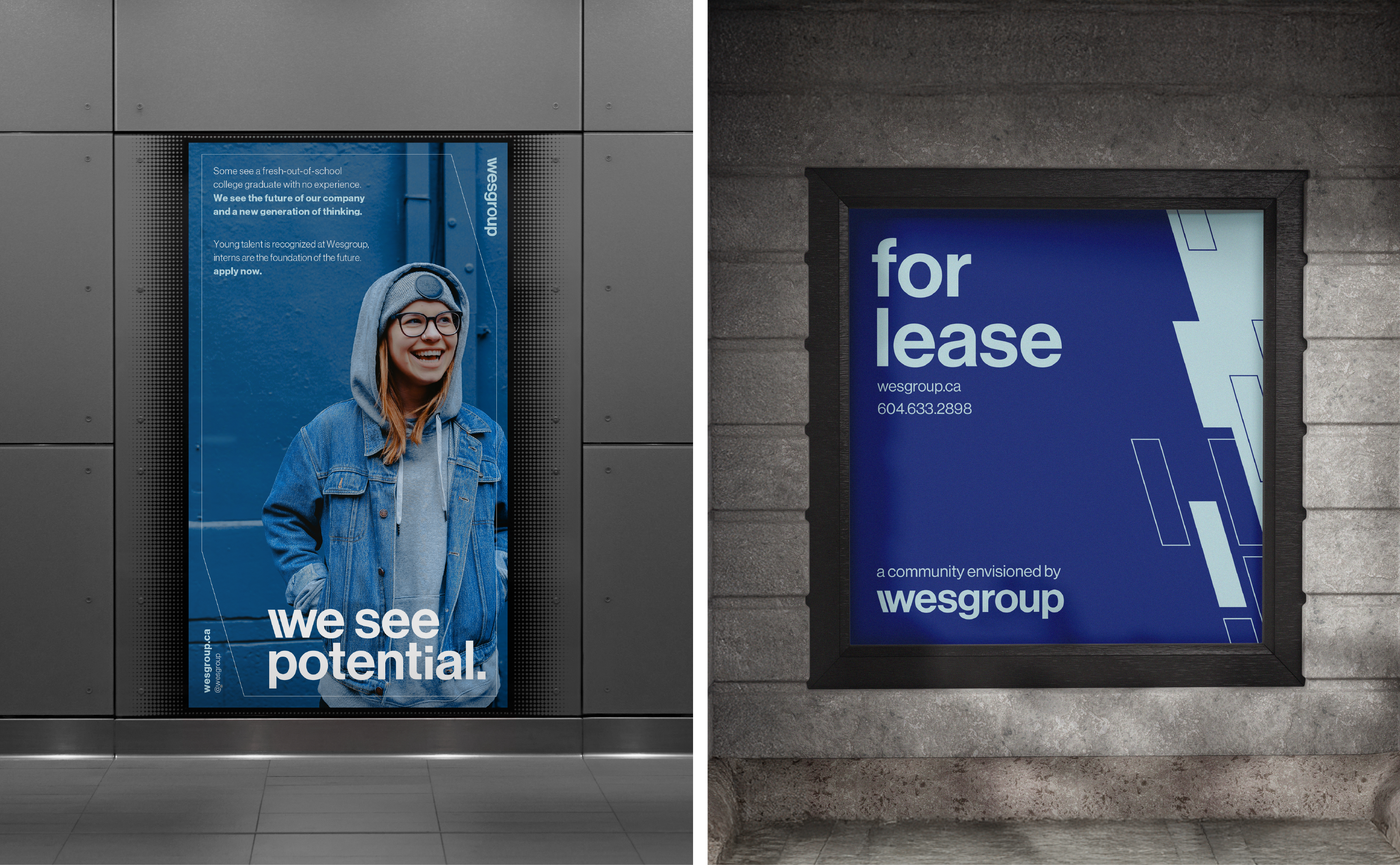
Wesgroup sees potential and opportunity in every project they undertake. As one of Vancouver’s most well-established building developers, they sought a brand refresh to better communicate their character and business intent. Creativity is at the heart of Wesgroup, requiring a trained eye and skilled hand to bring visions to life, understanding the nuances of every detail and phase of a larger process. Their team is dedicated to transforming small ideas into significant outcomes, always grounded in care, consideration, and dignity. Potential drives progress. Progress drives completion. Completion builds community.
Mood & Tone
To embody a sense of inspiration, staying rooted in the human experience and reflecting the boundless potential within us all.
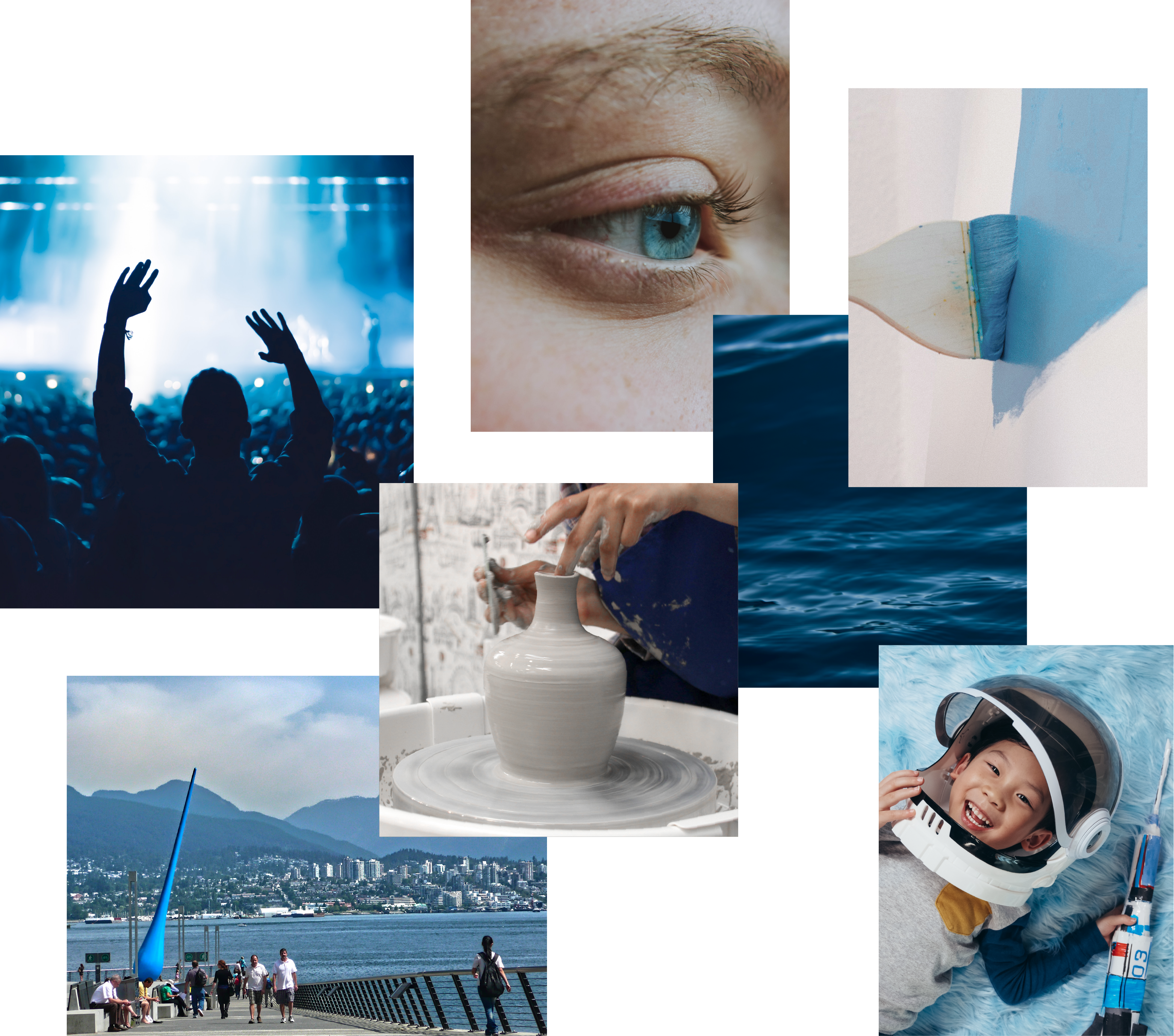
Colour Story
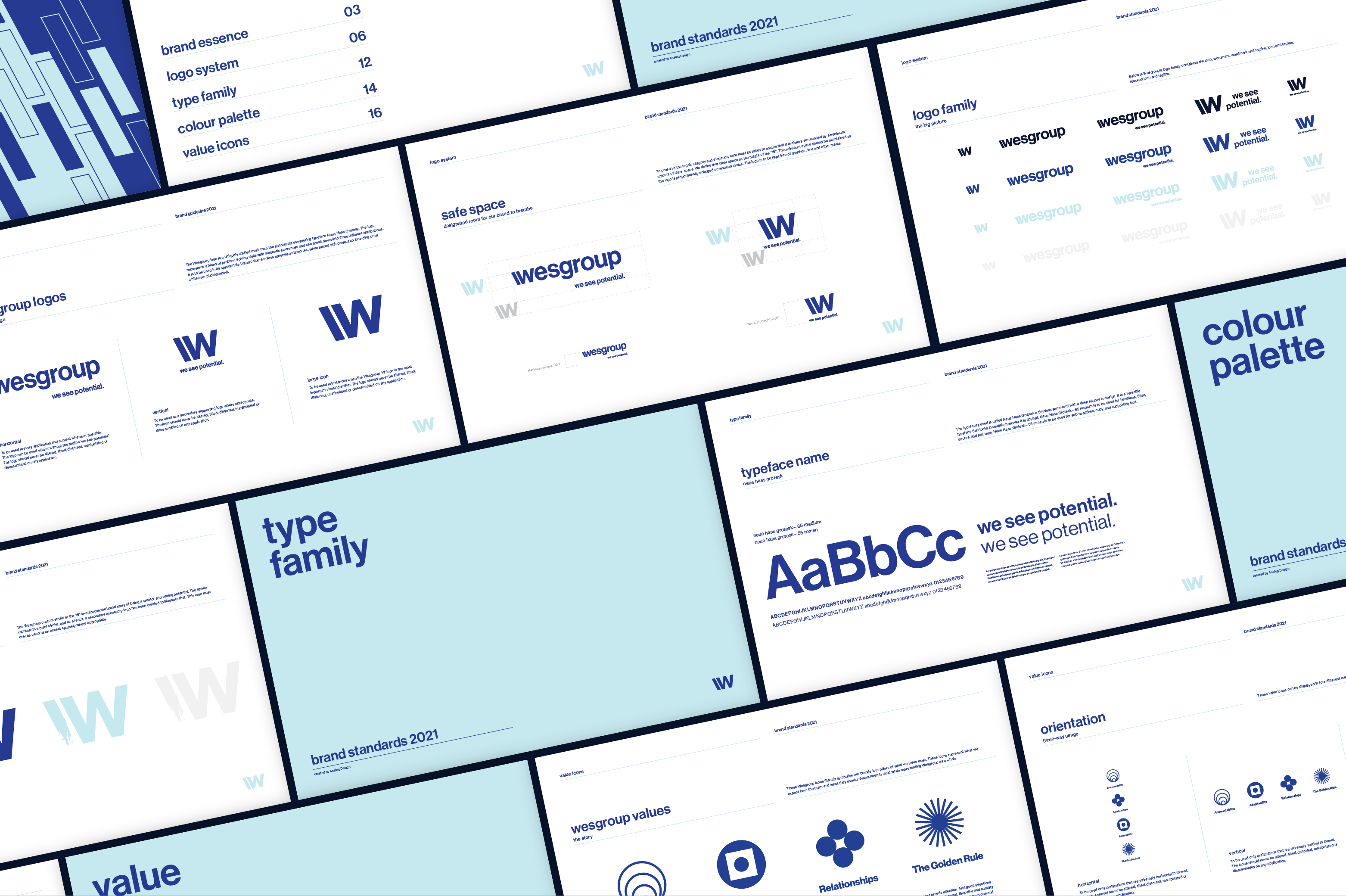
The Wesgroup colour palette modernises the past while embracing natural elements to round out a vision that is vibrant, sophisticated and human.

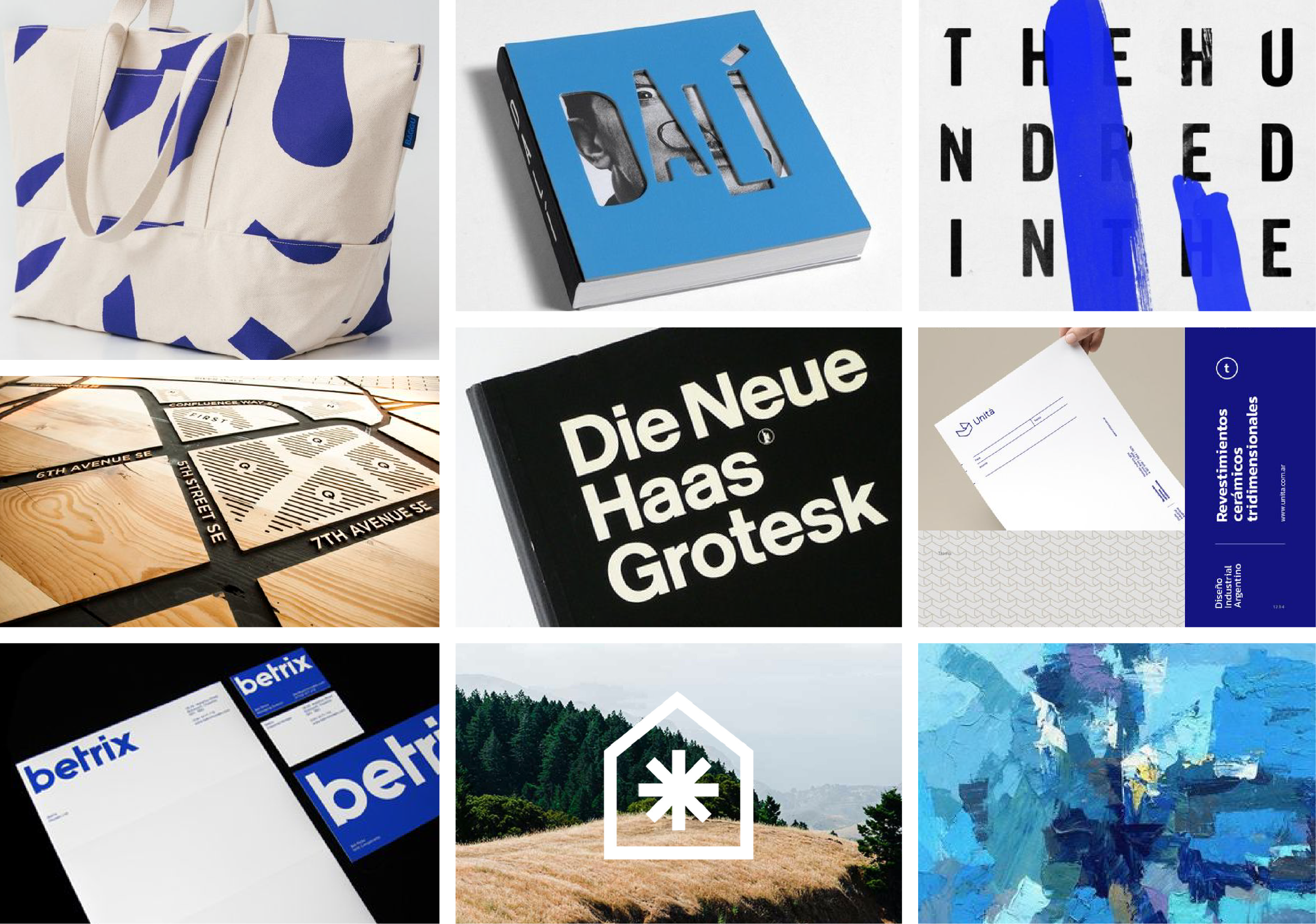
Graphic Inspiration
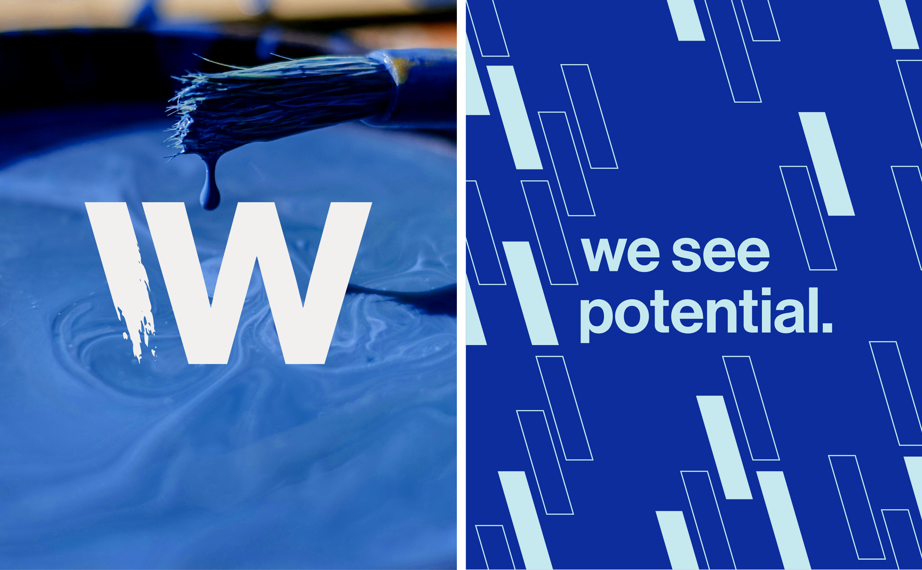
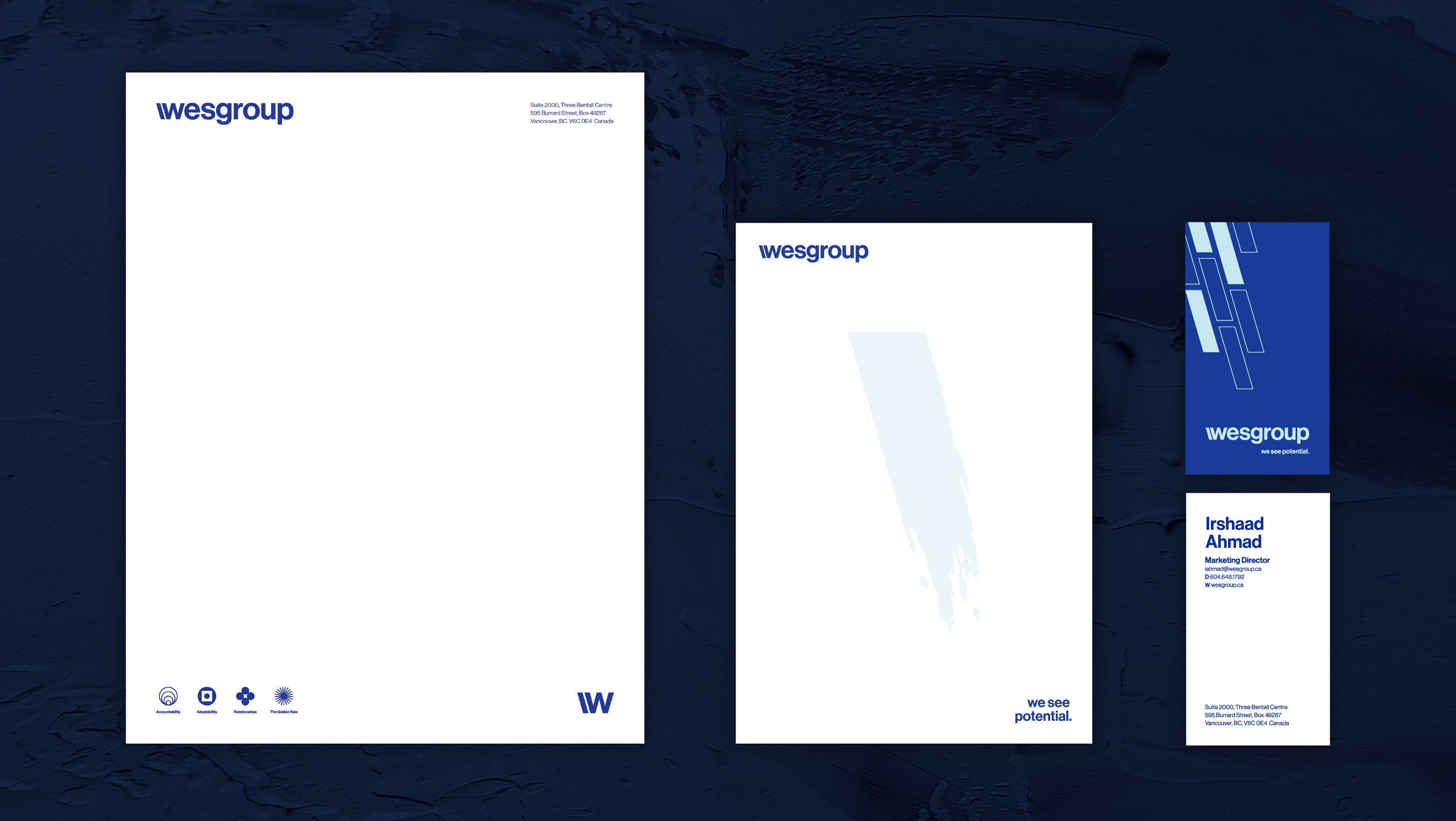
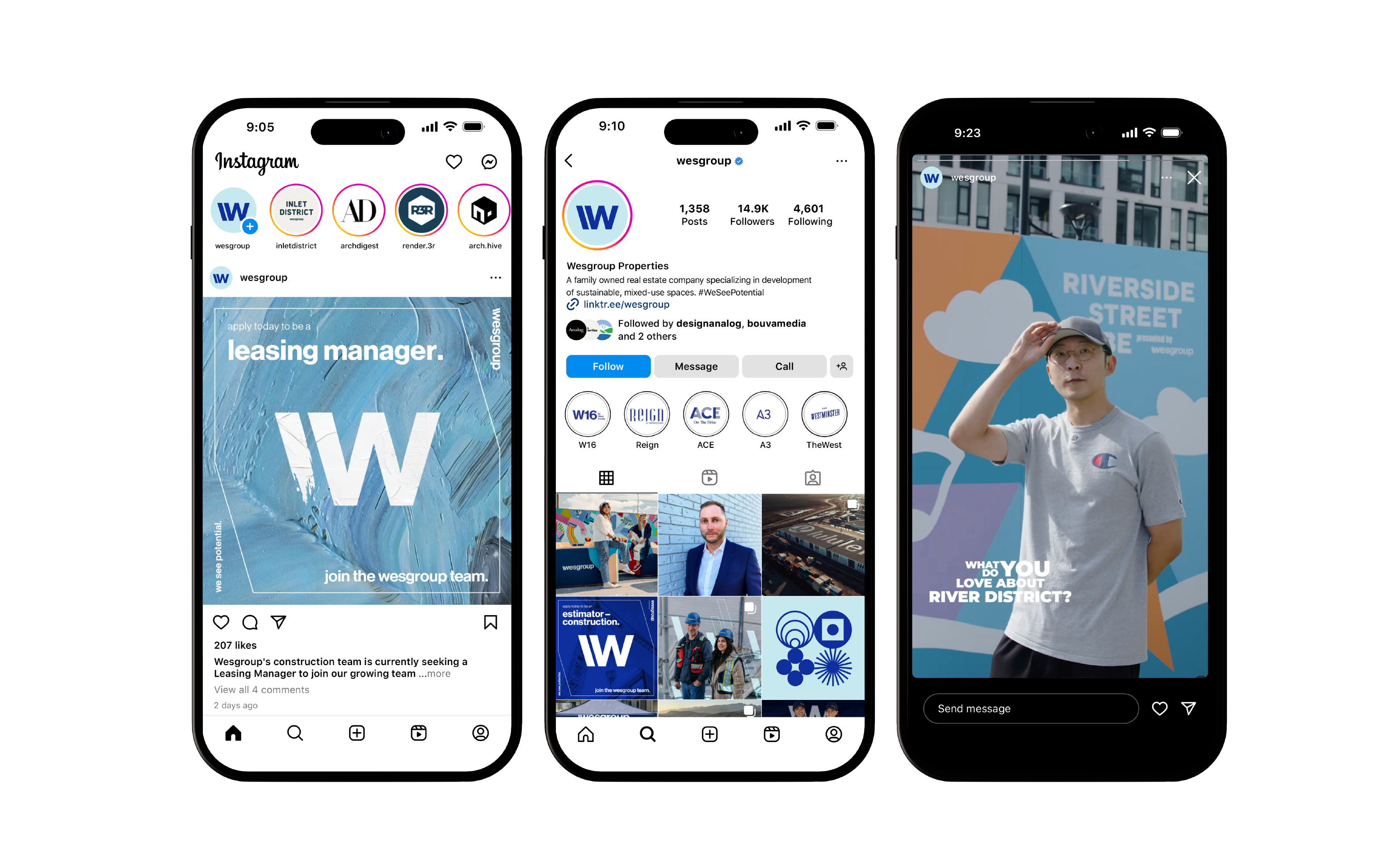
Inspiration stemmed from the desire to convey the essence of the creative process through artful visuals and graphic elements, incorporating literal expressions like paint, patterns, and natural textures.
Brand Identity Refresh
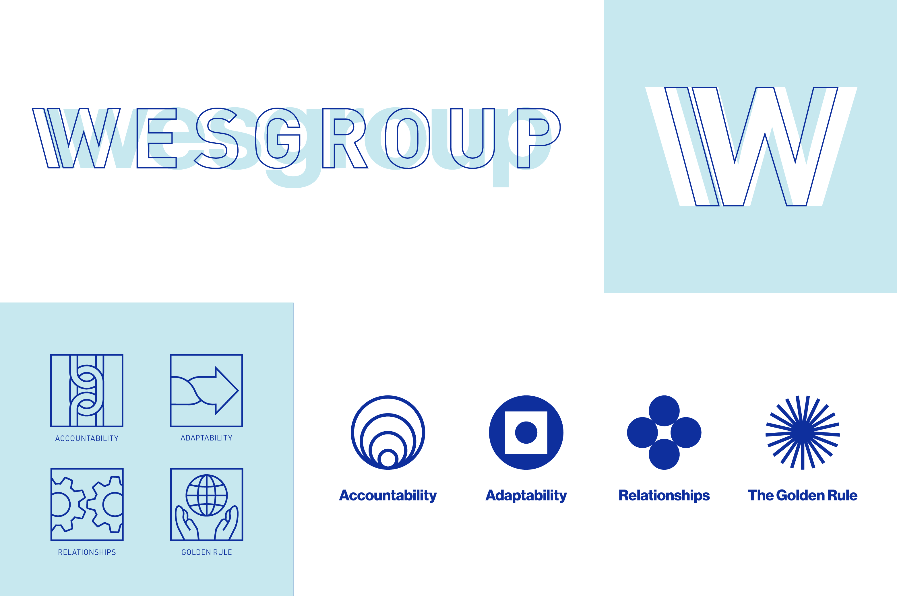
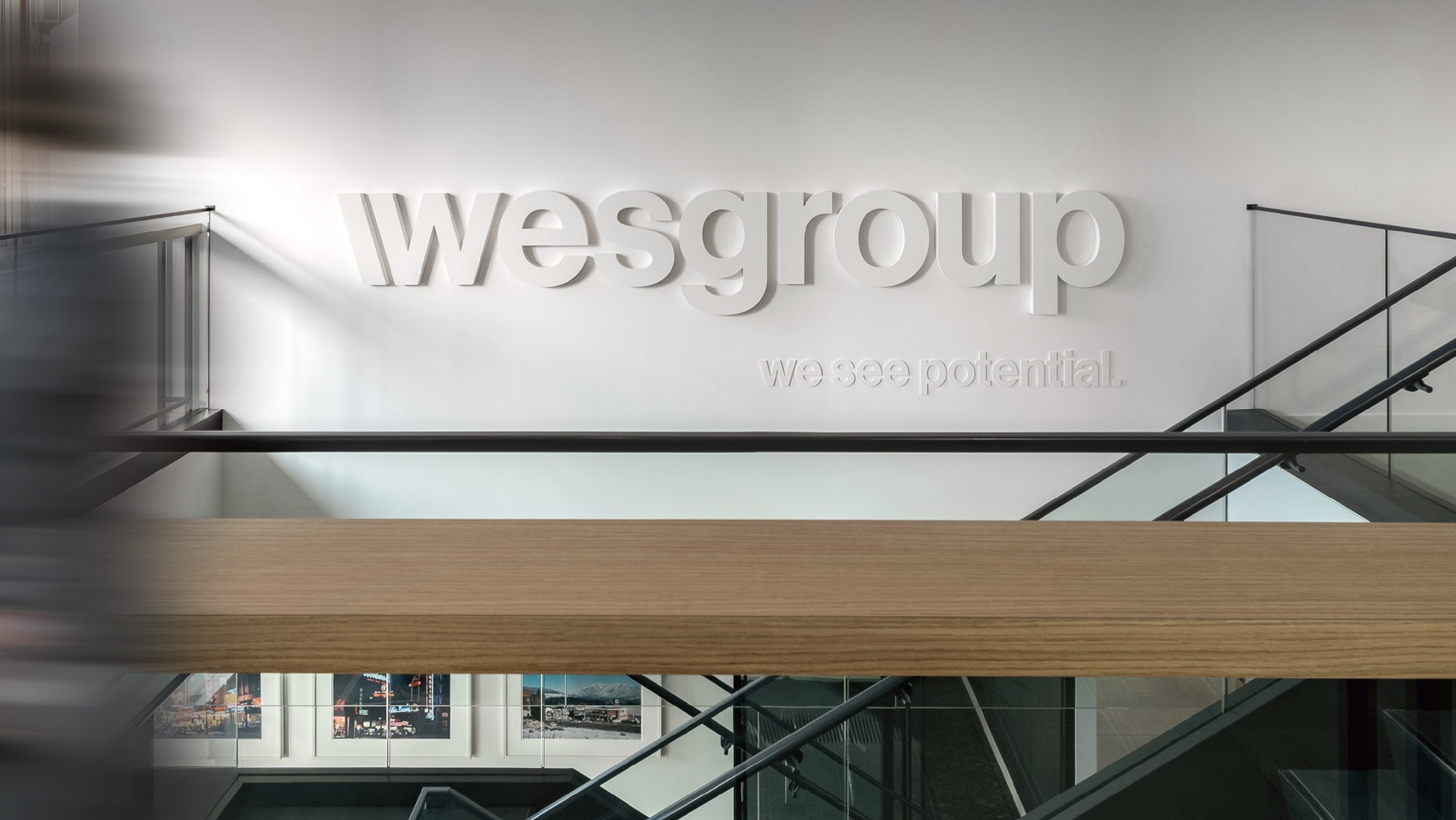
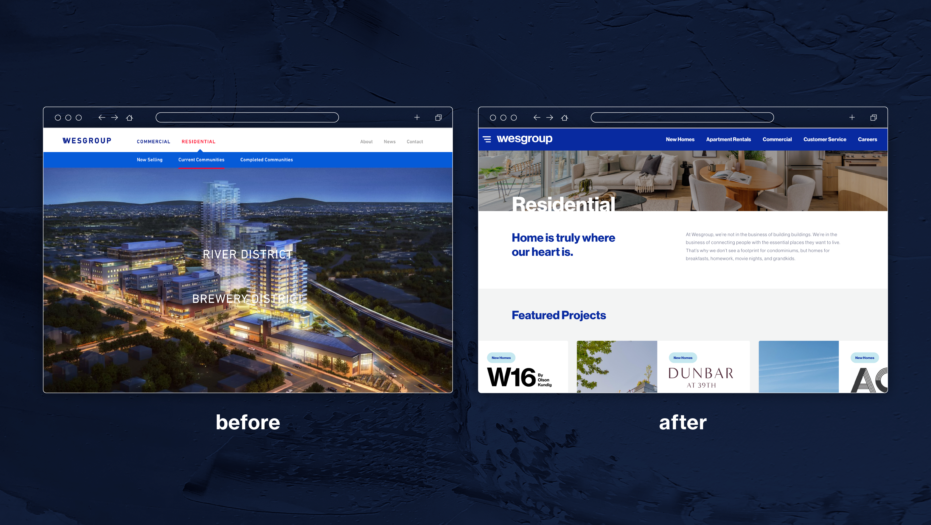
The original Wesgroup logo had accumulated significant brand equity over the years. However, a shift was needed to transition the brand from a corporate entity to a lifestyle-focused brand centred on people. It was found that typesetting the wordmark in uppercase letters reinforced an overly corporate tone. Switching to lowercase and a Swiss-style sans-serif typeface created a more approachable and friendly identity. Additionally, the core value icons were redesigned to align with this tone, using visually compelling iconography to convey the brand’s message more effectively.
