Client
Darwin, Citimark & Magnum
Services
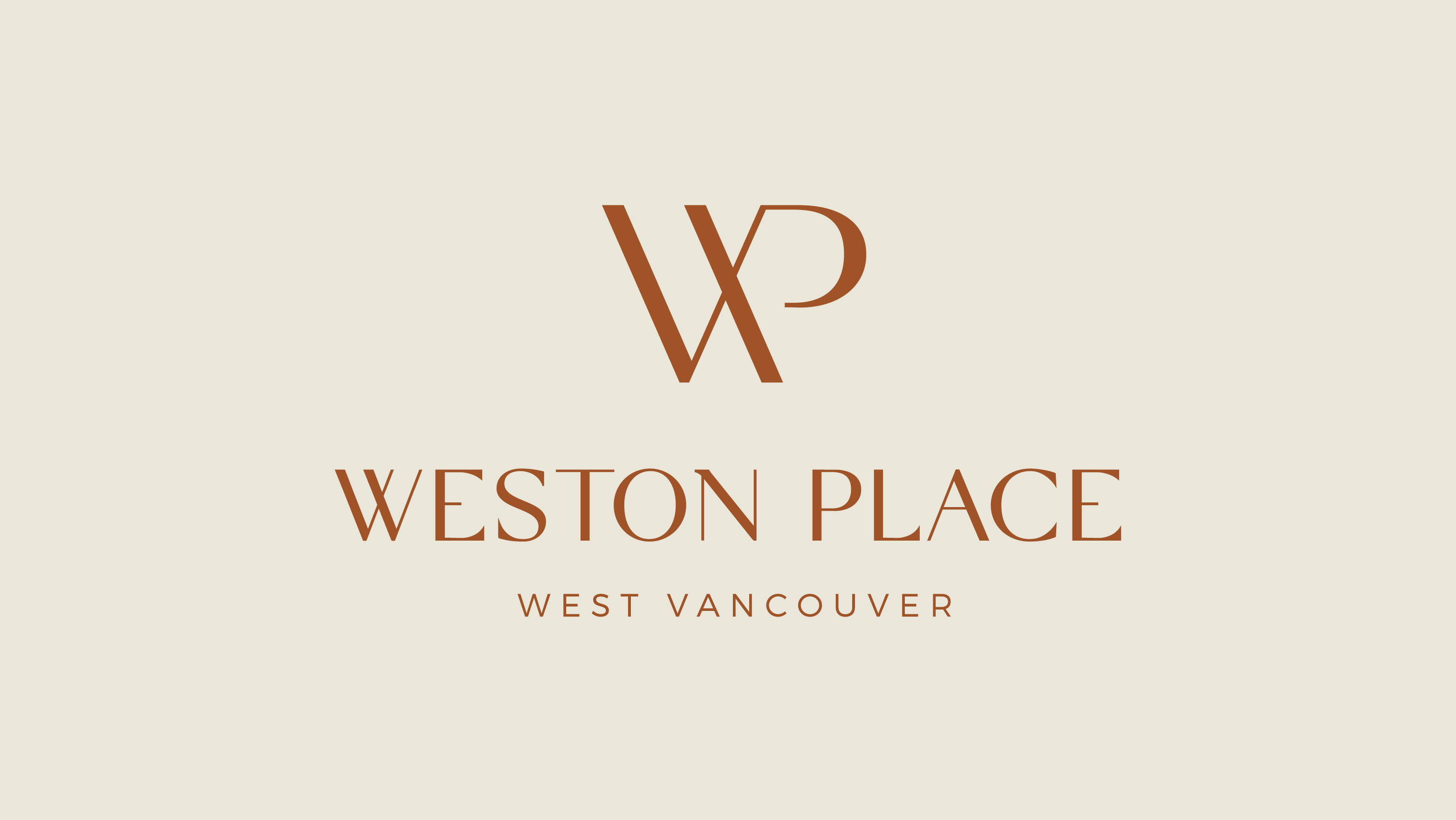
Brand Identity
Agency
Analog Design, Vancouver BC
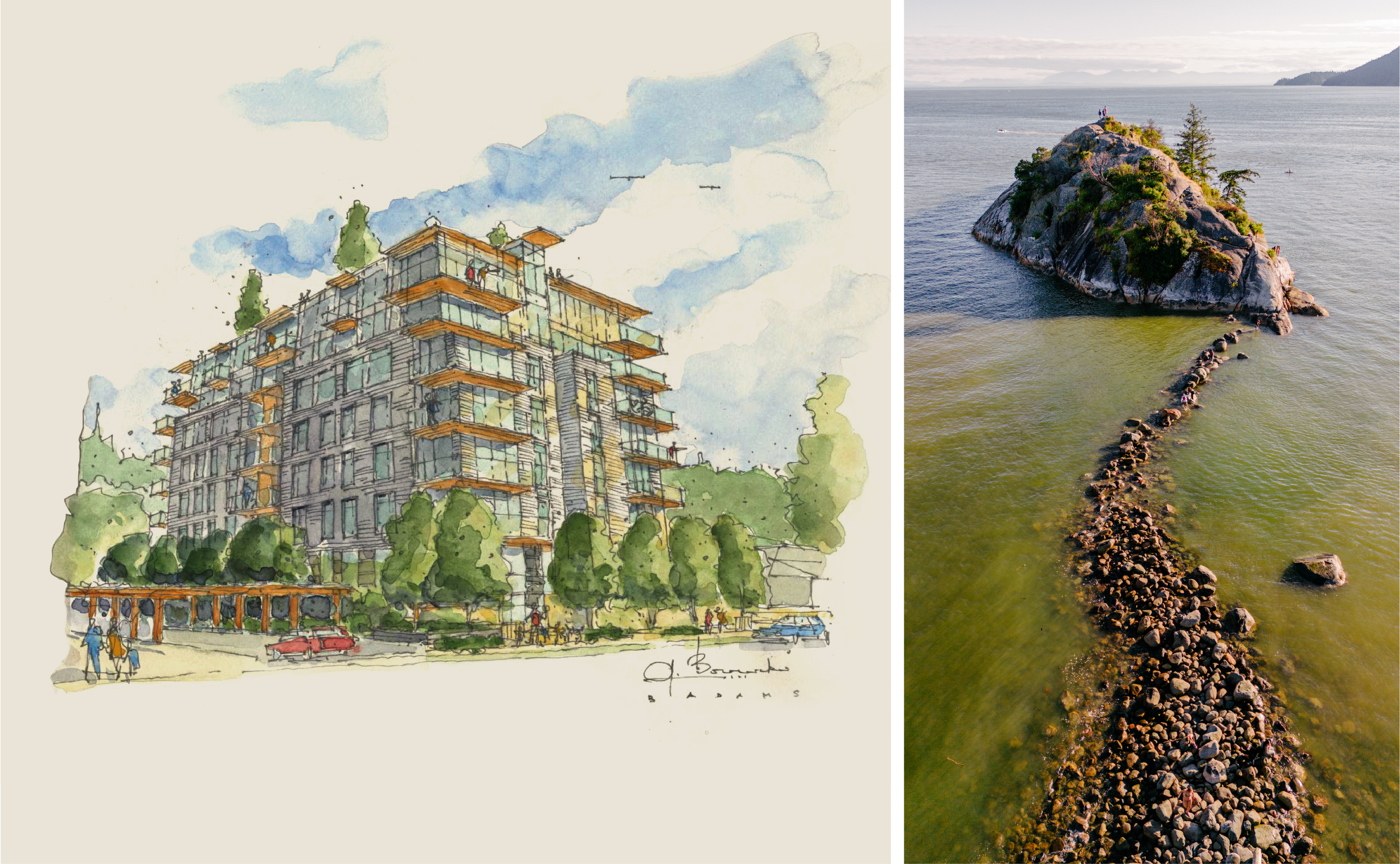
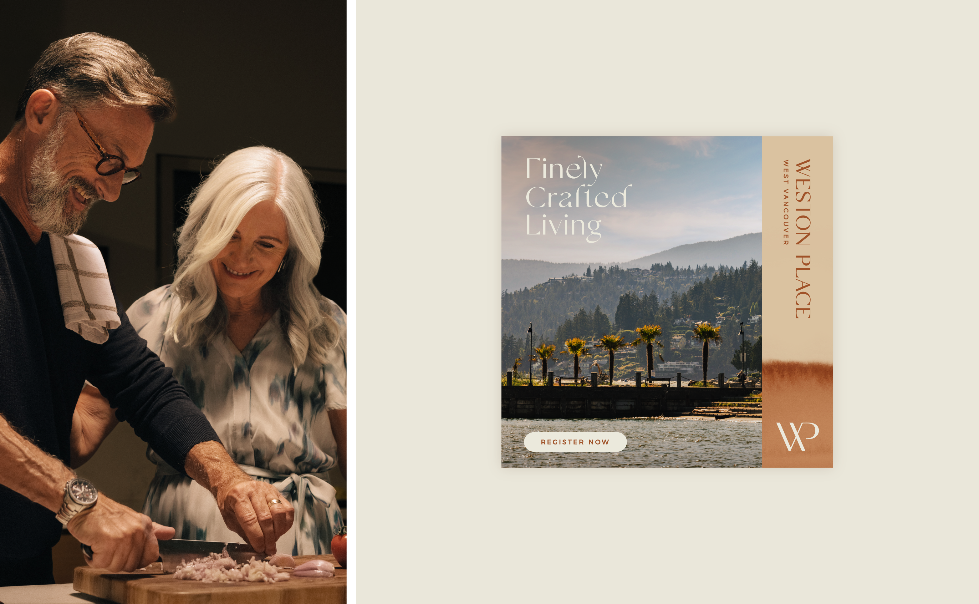
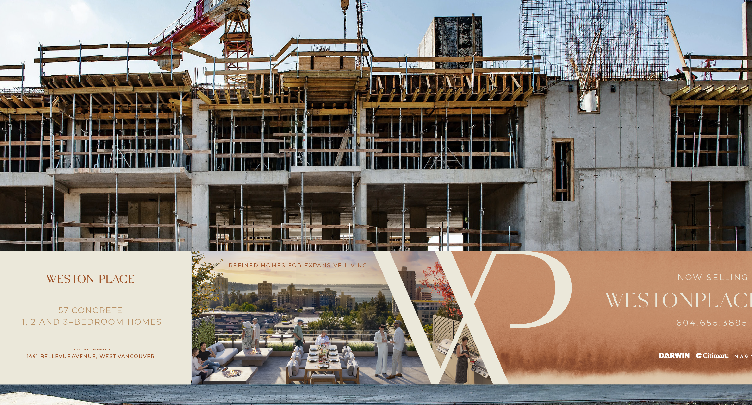
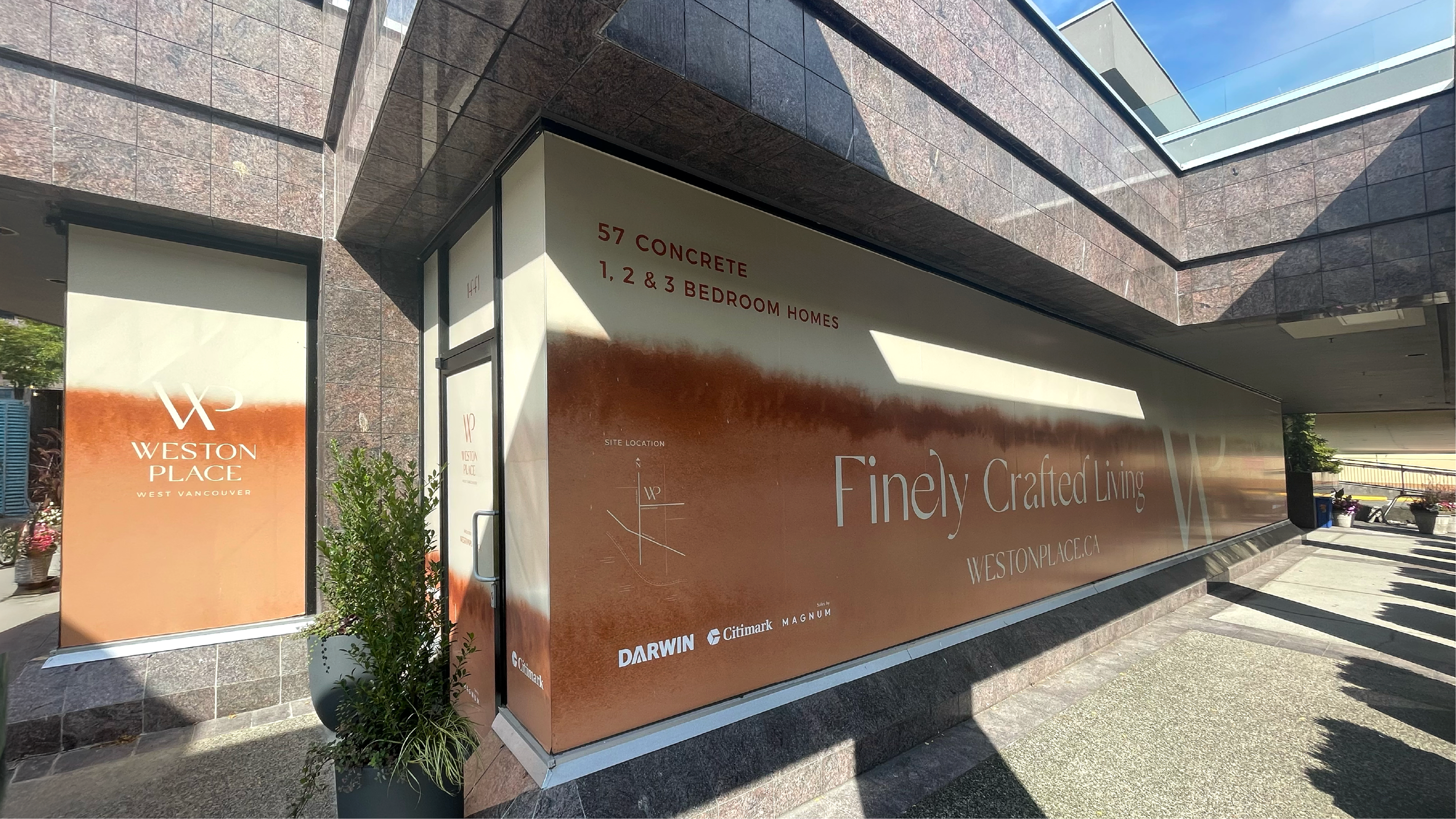
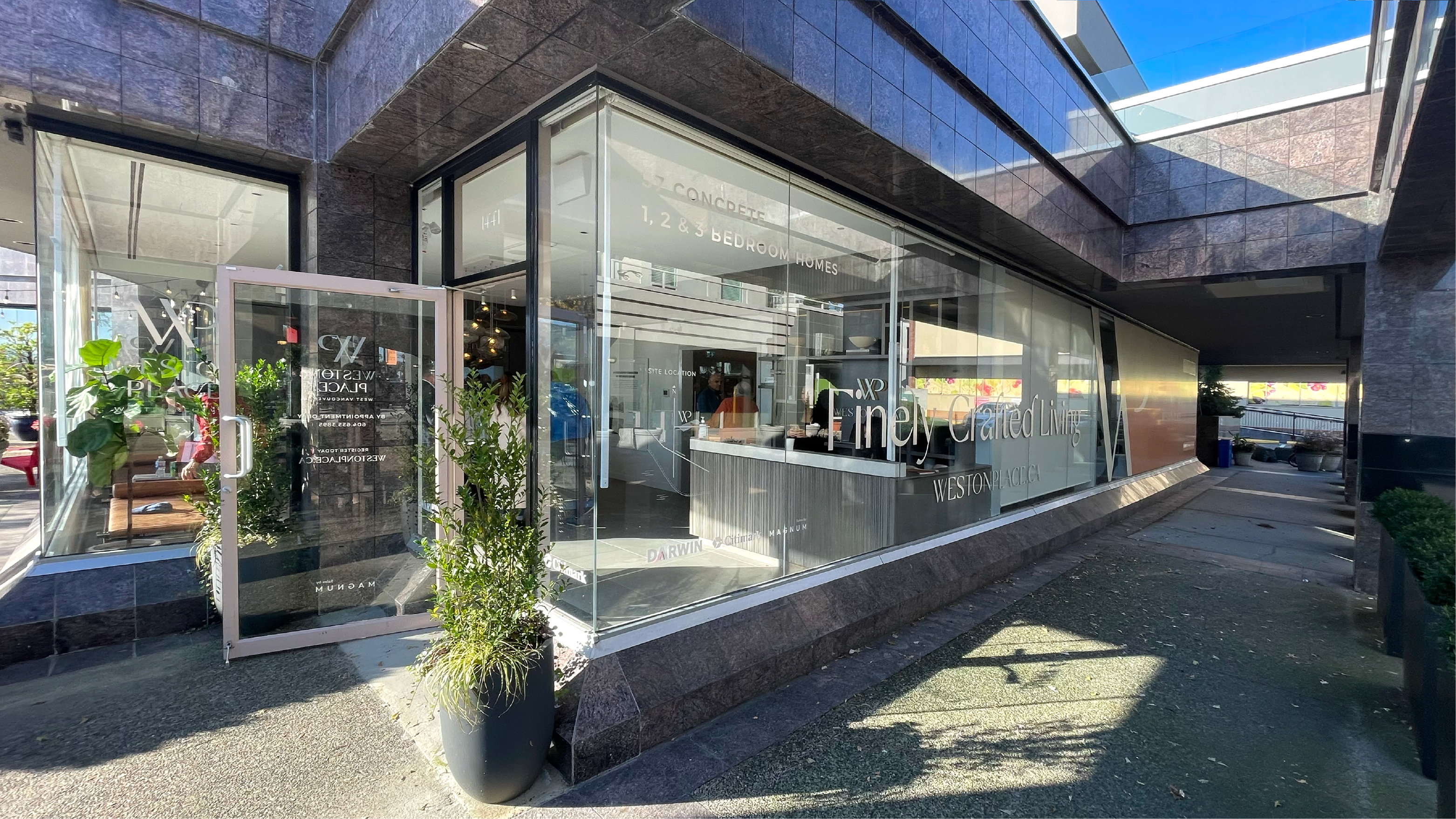
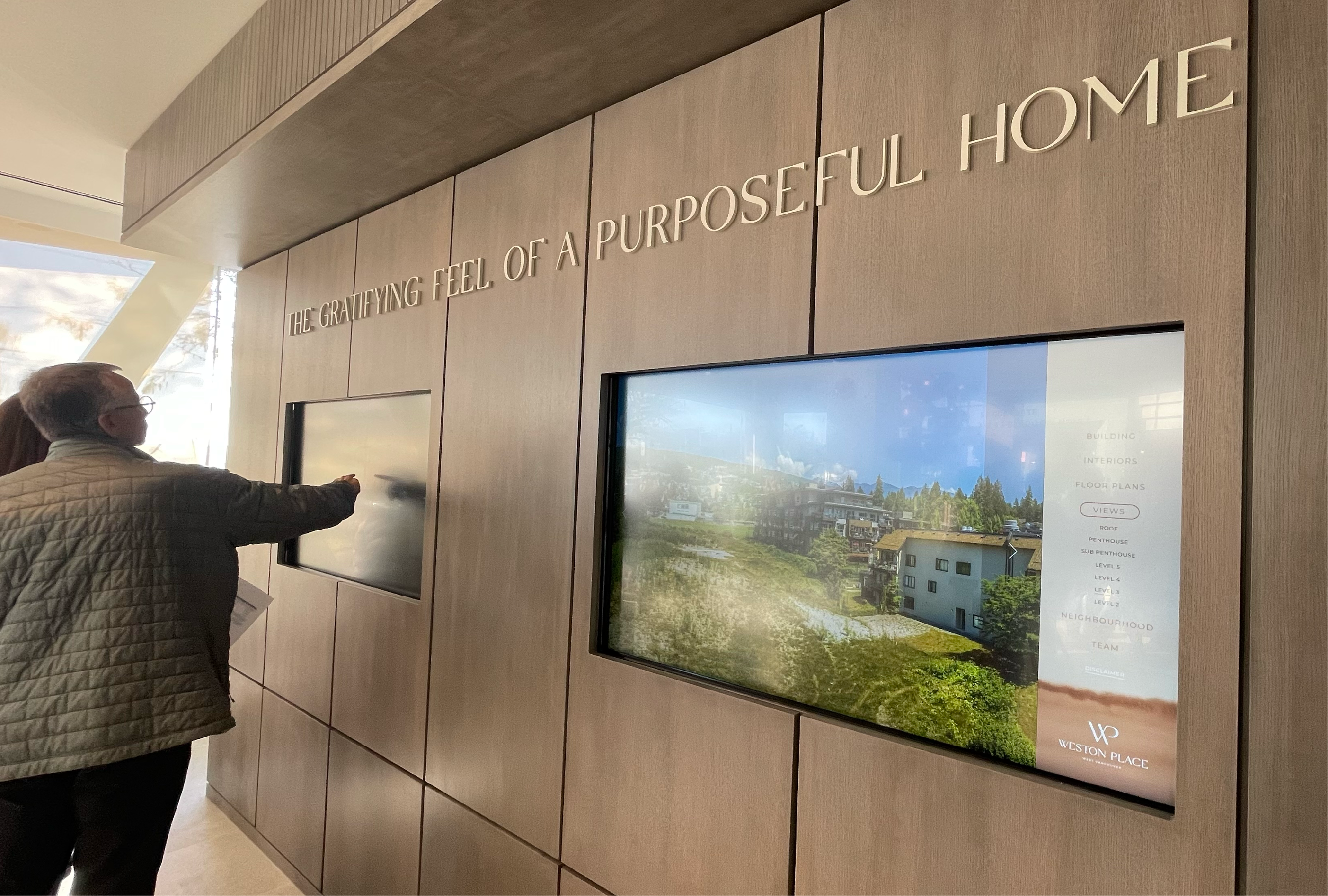
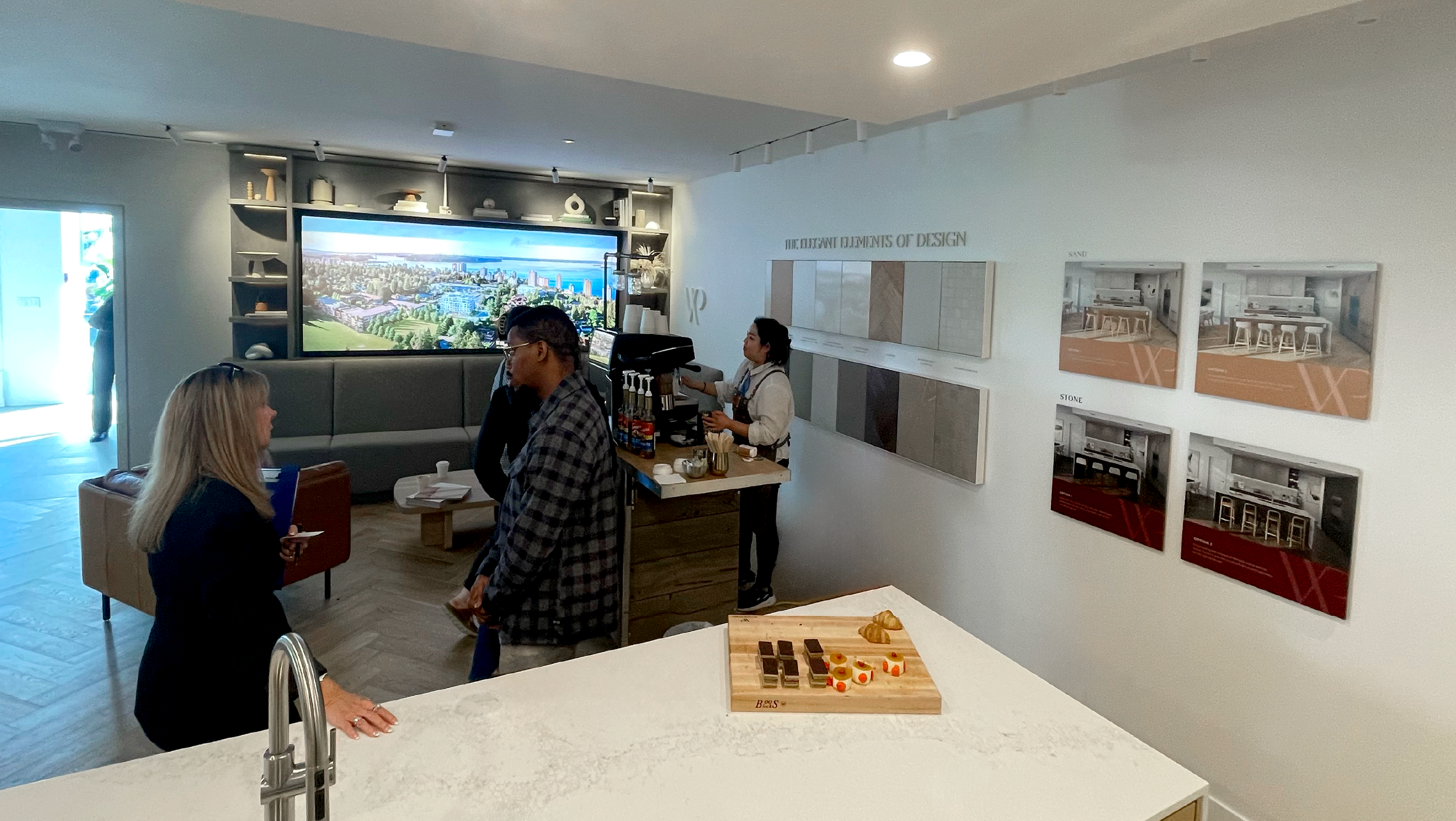
Weston Place is a brand Identity done for an upscale development tucked gently into the core of West Vancouver, it’s a community that celebrates the big things, the little things, and the important things. It’s living close to family and embracing valuable time with grandkids regularly. It’s having a first-class recreational facility across the street from your home. It’s living on a green street with epic views of oceans and mountains… you made something special of this life… and it continues to bear fruit.
Mood & Tone
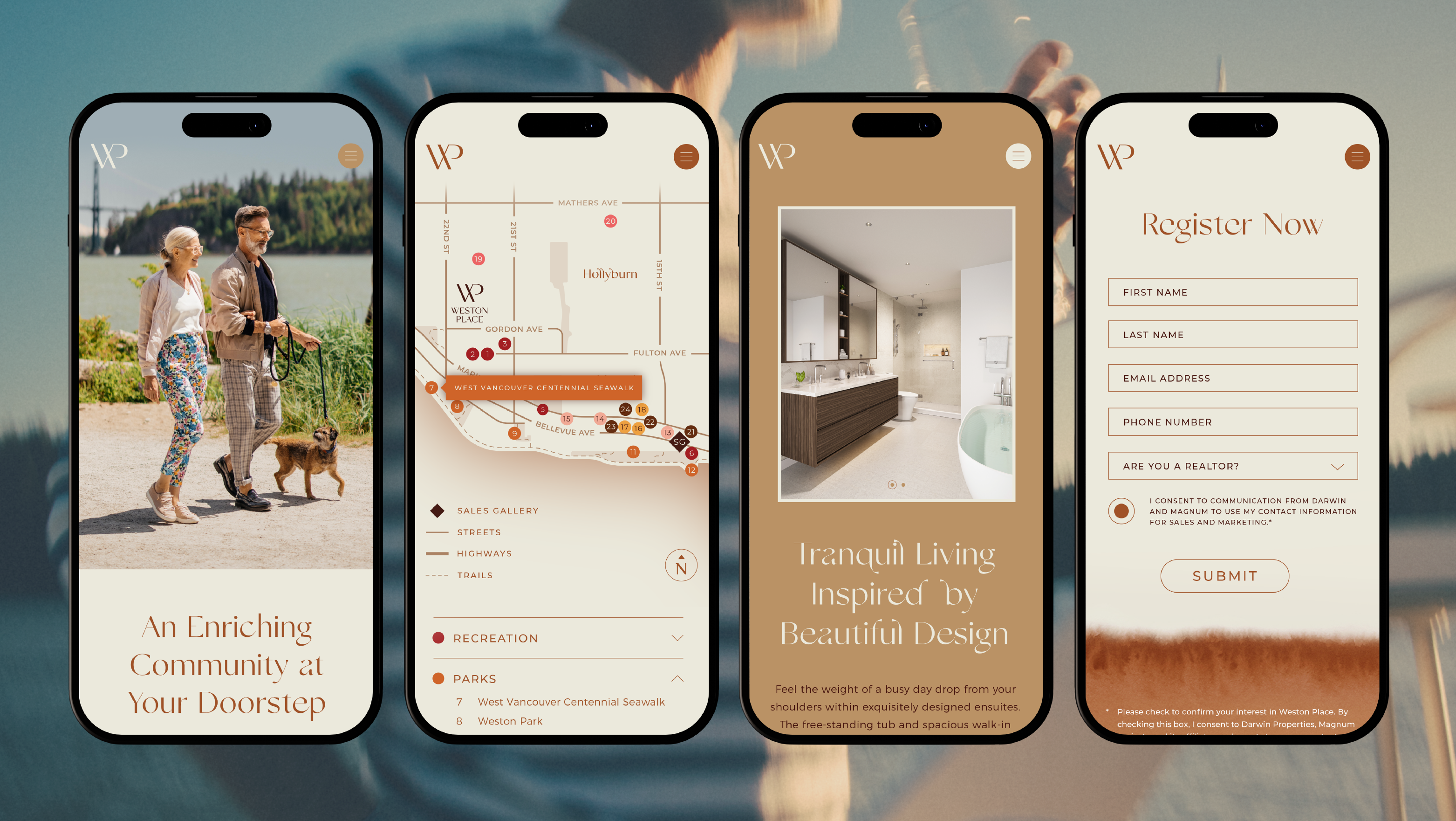
Creating the right atmosphere is key. This involves capturing West Vancouver through an authentic, unobtrusive lens—using documentary-style photography that draws viewers in and makes them feel like a part of the community.
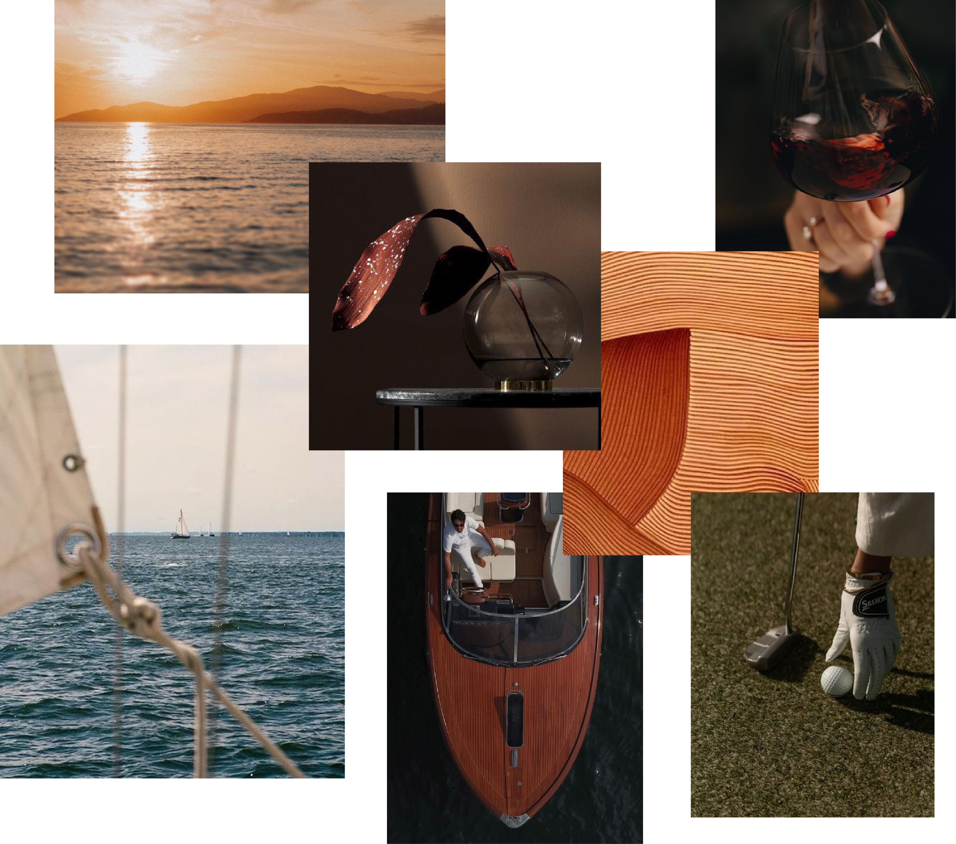
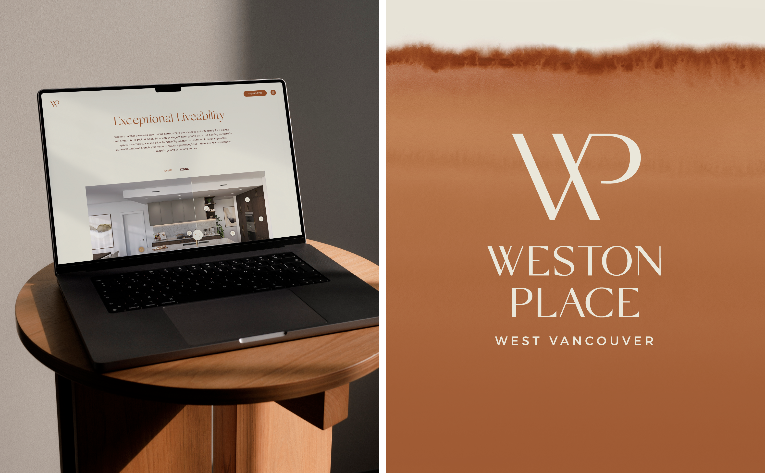
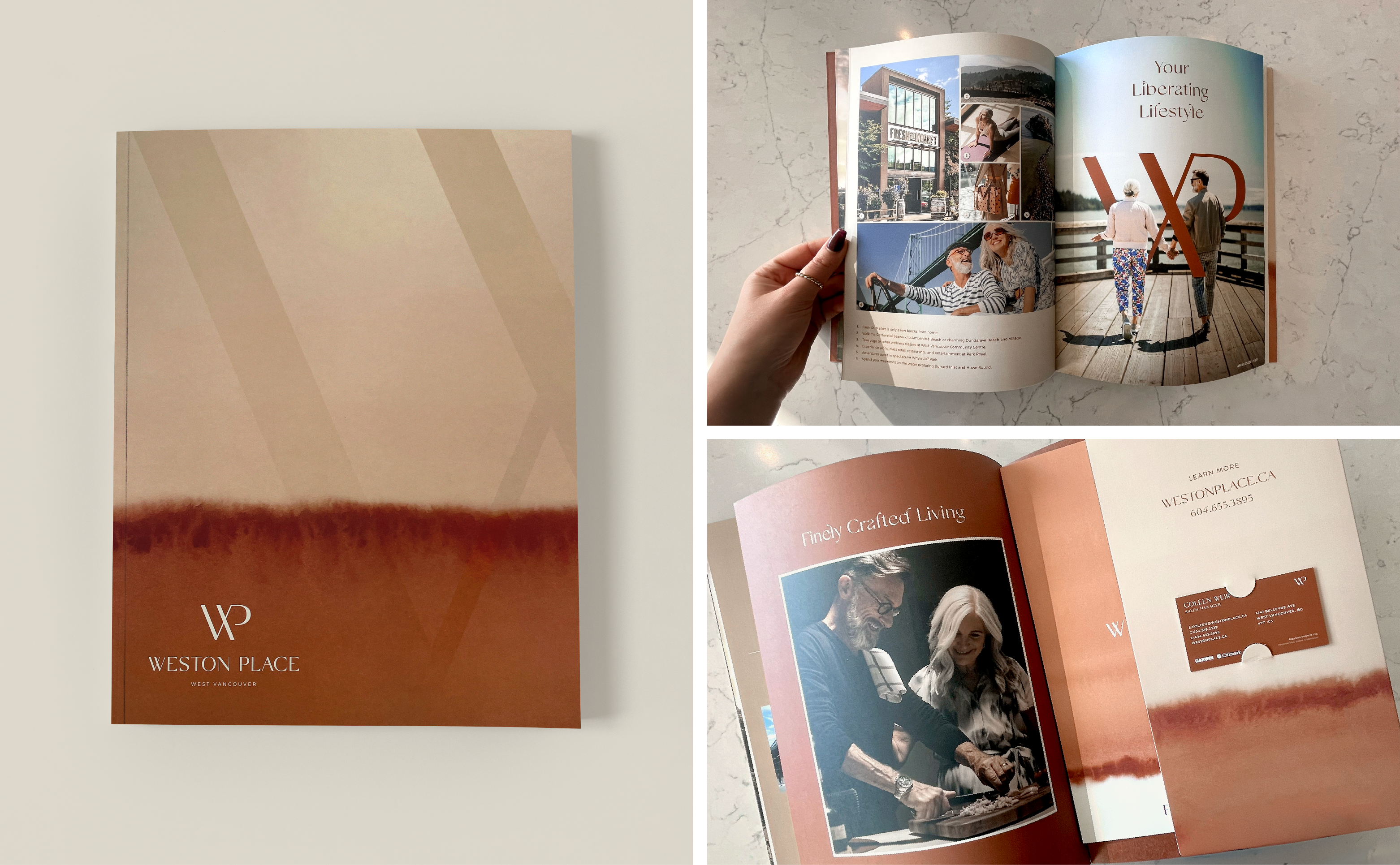
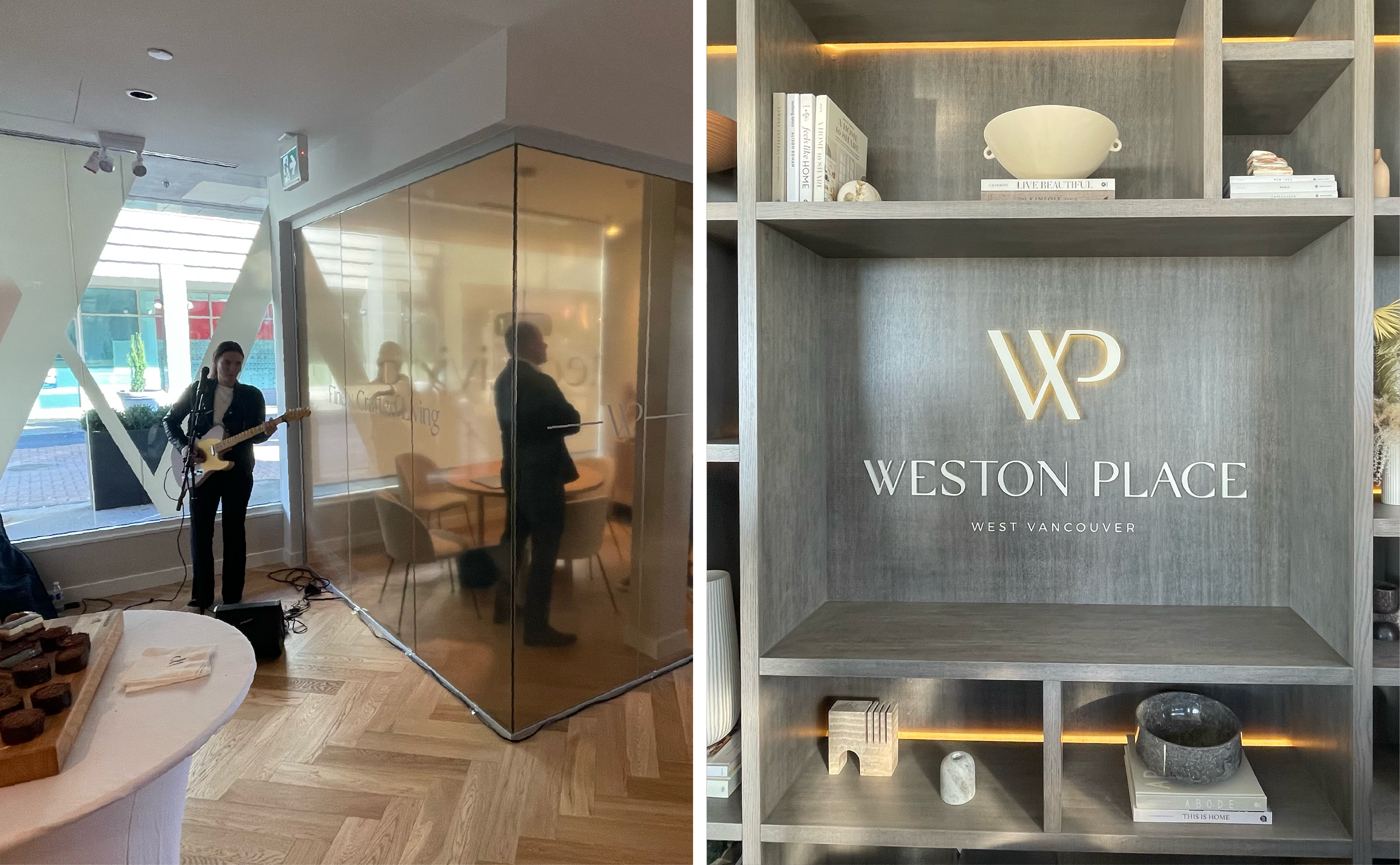
Colour Story
The Weston Place palette draws from a modern selection of neutral and warm tones that emulate feelings of comfort and calmness. They are also indicative of nature’s textures, which play a large role in West Vancouver’s environment.
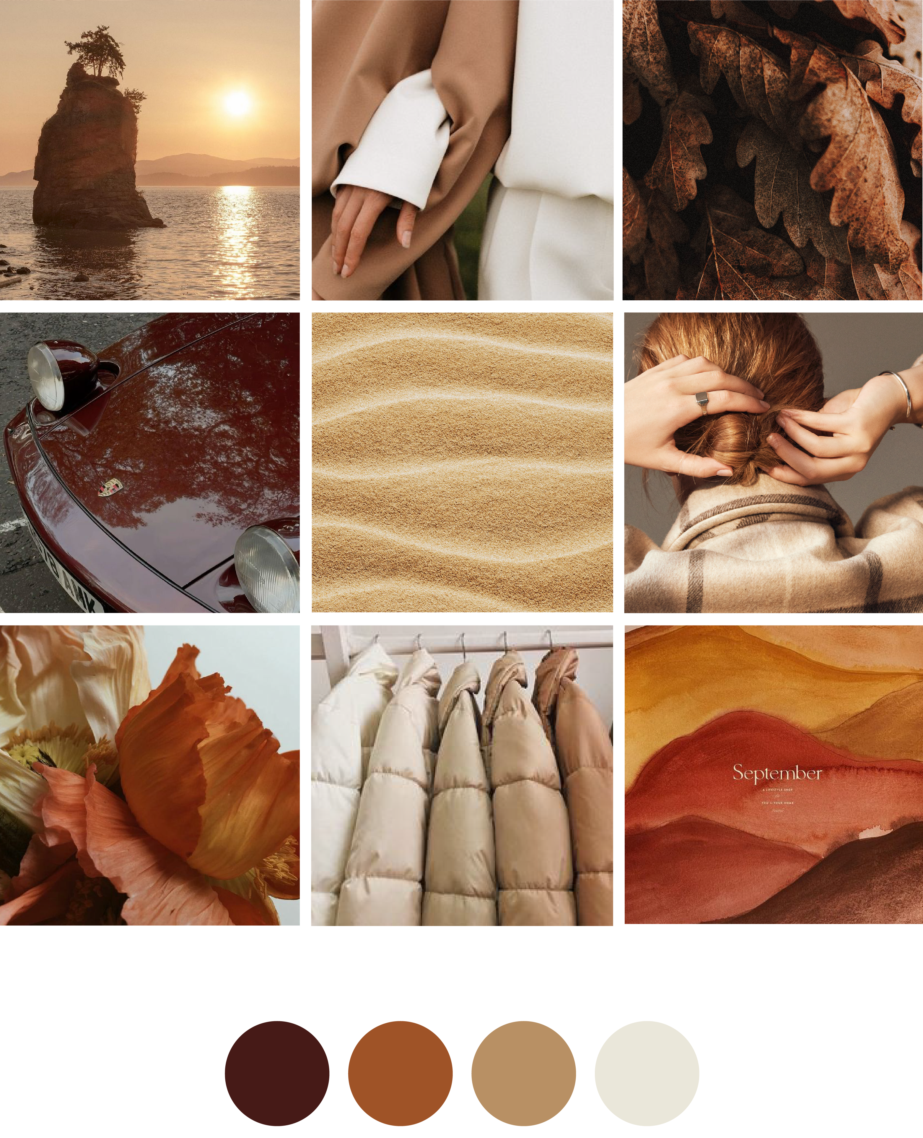
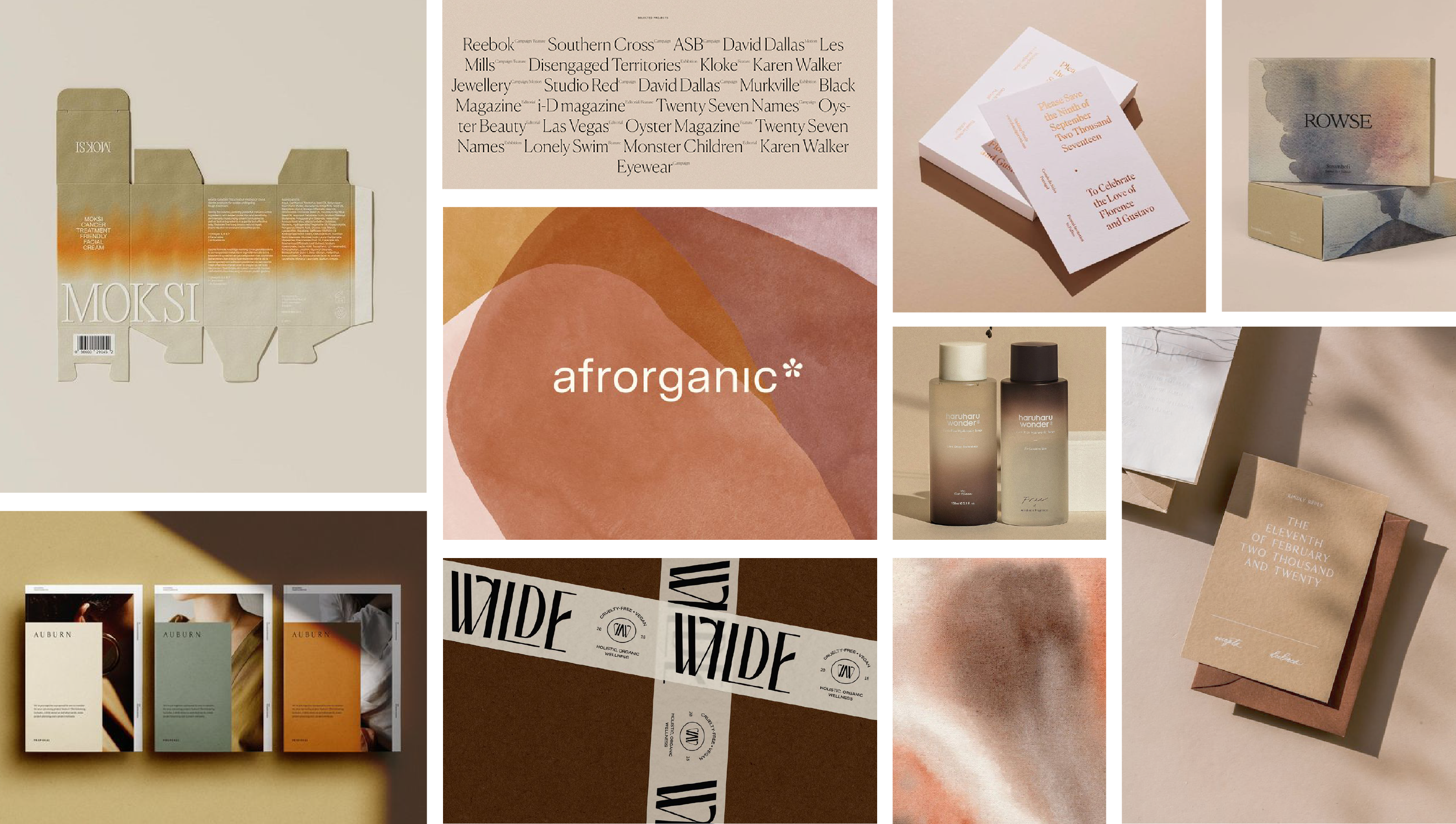
Graphic Inspiration
Drawing from the idea of creating warmth and play, inspiration was found in the use of high contrast, watercolour texture, supporting iconography and photography that instilled a sense of leisure and free spirit.